


I love JavaScript and all the amazing engineers who helped to make Web Development simpler and more joyful. But, as a consultant and UI engineer, I always ask myself the same question “why do I have to write the same exact custom element every time I start a new project?” Whether it’s Vue, React, Angular… I always end up writing the same code again and again and again.
Web Components to the rescue!
I’ve always been a big fan of Web Components since Polymer took the initiative to simplify and make it more declarative. The fact that you can write it once and use it anywhere is just so appealing to me as a UI architect. I’m not saying that Web Components is the way to go and will replace frameworks in the future. I just think it will coexist with other frameworks as a base layer for more generic custom elements such as buttons, checkboxes, file uploaders…etc. It is a perfect solution to build a design system that can be used across the whole organization, even if the tech stack is different.
OK, let’s cut to the chase…

The reason why I’m writing this article is to show you how to create a custom file upload element in vanilla JavaScript that can be used in any library/framework. I decided for the first time to take the step and create a Web Component and successfully use it in multiple different real-world projects without having to write the same code ever again.
Initialize a Web Component
Open your favorite JavaScript editor or simply create a folder with just two Notepad files!
file-upload.jsfile for the File Upload Component.main.htmlfile to consume the web component.

In file-upload.js, will initialize and define a custom element with a simple file upload element:
document.createElementenable us to create a template that will not yet be rendered in the DOM- In the
constructor, we will call the super class since we are extending and inheriting fromHTMLElement this.attachShadow()attaches a shadow DOM tree to the specified element.- Finally, will append the template to the
shadowRoot
// Create template
const template = document.createElement('template');
template.innerHTML = /*html*/`
  <style>
  </style>
  <input type="file" />
`;

class FileUpload extends HTMLElement {
  constructor() {
    // Inititialize custom component
    super();
    this.attachShadow({ mode: 'open' });
    this.shadowRoot.appendChild(template.content.cloneNode(true));
  }
}

window.customElements.define('file-upload', FileUpload);
To understand Custom Elements, Shadow DOM and HTML Templates in more details, please visit MDN Web Docs
Now, we can import the component in main.html and use it.
<!DOCTYPE html>
<html>
<script src="./file-upload.js"></script>
<body>
<file-upload></file-upload>
</body>
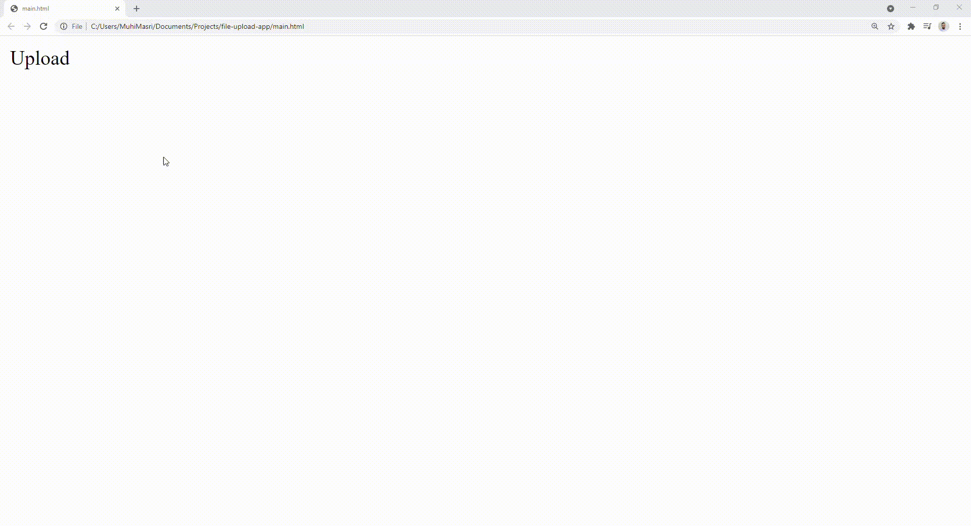
</html>So far nothing special, just a normal native-looking file upload element:

Create a Custom File Upload
The easiest way to customize a native file input is to do the following steps:
- Hide the file
inputusing thehiddenattribute. - Use a
labelelement as a replacement with aforattribute to indicate which element you’d like to trigger - Finally, customize the
labelelement however you like using CSS
// Create template
const template = document.createElement('template');
template.innerHTML = /*html*/`
  <style>
  </style>
  <article>
    <label for="fileUpload">Upload</label>
    <section>
      <span></span><button>Remove</button>
    </section>
  </article>
  <input hidden id="fileUpload" type="file" />
`;

class FileUpload extends HTMLElement {
  constructor() {
    // Inititialize custom component
    super();
    this.attachShadow({ mode: 'open' });
    this.shadowRoot.appendChild(template.content.cloneNode(true));
  }
}

window.customElements.define('file-upload', FileUpload);
You’ll notice that we added a span and button elements. Those will be used in the next step to display and remove the currently uploaded file.
Implement event listeners
In this step, we will implement the logic associated with showing and removing the selected file:
- The file input
onchangeevent listener is used to update the selected file and display the proper name on the screen. Also, we are dispatching a custom event with the deleted file. The developer can subscribe and apply a custom logic if required - The delete button
onclickevent listener is used to delete the selected file and remove it from the DOM. Also, we are dispatching a custom event with the deleted file - We added a helper
dispatchfunction andselectgetter to have a neater syntax.
// Create template
const template = document.createElement('template');
template.innerHTML = /*html*/`
  <style>
  </style>
  <article>
    <label for="fileUpload">Upload</label>
    <section hidden>
      <span></span><button>Remove</button>
    </section>
  </article>
  <input hidden id="fileUpload" type="file" />
`;

class FileUpload extends HTMLElement {
  constructor() {
    // Inititialize custom component
    super();
    this.attachShadow({ mode: 'open' });
    this.shadowRoot.appendChild(template.content.cloneNode(true));

    // Add event listeners
    this.select('input').onchange = (e) => this.handleChange(e);
    this.select('button').onclick = () => this.handleRemove();
  }

  handleChange(e) {
      const file = e.target.files[0];
      this.select('section').style.display = "block";
      this.select('span').innerText = file.name;
      this.dispatch('change', file);
  }

  handleRemove() {
    const el = this.select('input');
    const file = el.files[0];
    el.value = "";
    this.select('section').style.display = "none";
    this.dispatch('change', file);
  }

  dispatch(event, arg) {
    this.dispatchEvent(new CustomEvent(event, {detail: arg}));
  }

  get select() {
      return this.shadowRoot.querySelector.bind(this.shadowRoot);
  }
}

window.customElements.define('file-upload', FileUpload);
If we run main.html, we should get the following results:
Add default styling
Although the next step will cover how we can enable developers to apply custom styling, we would still need to offer a basic look and feel:
- The
labelelement will look like a default native button - The remove
buttonwill be replaced with an ‘X’ icon. We can use some of the built-in HTML characters - And the rest is just layout tweaks and improvements.
// Create template
const template = document.createElement('template');
template.innerHTML = /*html*/`
  <style>
      :host {
        font-size: 13px;
        font-family: arial;
      }
      article {
          display: flex;
          align-items: center;
      }
      label {
        background-color: rgb(239, 239, 239);
        border: 1px solid rgb(118, 118, 118);
        padding: 2px 6px 2px 6px;
        border-radius: 2px;
        margin-right: 5px;
      }
      button {
          border:0;
          background: transparent;
          cursor: pointer;
      }
      button::before {
          content: '\\2716';
      }
  </style>
  <article>
    <label for="fileUpload">Upload</label>
    <section hidden>
      <span></span><button></button>
    </section>
  </article>
  <input hidden id="fileUpload" type="file" />
`;

class FileUpload extends HTMLElement {
  constructor() {
    // Inititialize custom component
    super();
    this.attachShadow({ mode: 'open' });
    this.shadowRoot.appendChild(template.content.cloneNode(true));

    // Add event listeners
    this.select('input').onchange = (e) => this.handleChange(e);
    this.select('button').onclick = () => this.handleRemove();
  }

  handleChange(e) {
      const file = e.target.files[0];
      this.select('section').style.display = "block";
      this.select('span').innerText = file.name;
      this.dispatch('change', file);
  }

  handleRemove() {
    const el = this.select('input');
    const file = el.files[0];
    el.value = "";
    this.select('section').style.display = "none";
    this.dispatch('change', file);
  }

  dispatch(event, arg) {
    this.dispatchEvent(new CustomEvent(event, {detail: arg}));
  }

  get select() {
      return this.shadowRoot.querySelector.bind(this.shadowRoot);
  }
}

window.customElements.define('file-upload', FileUpload);

Enable custom styling
Since we are using the shadow DOM, the classes we defined are encapsulated and can’t be modified directly. The only way to enable custom styling is through CSS “part”, which allows developers to style CSS properties on an element inside of a shadow tree.
Below, we will add part="upload-button" to the label element to enable CSS customization:
// Create template
const template = document.createElement('template');
template.innerHTML = /*html*/`
<style>
:host {
font-size: 13px;
font-family: arial;
}
article {
display: flex;
align-items: center;
}
label {
background-color: rgb(239, 239, 239);
border: 1px solid rgb(118, 118, 118);
padding: 2px 6px 2px 6px;
border-radius: 2px;
margin-right: 5px;
}
button {
border:0;
background: transparent;
cursor: pointer;
}
button::before {
content: '\\2716';
}
</style>
<article>
<label part="upload-button" for="fileUpload">Upload</label>
<section hidden>
<span></span><button></button>
</section>
</article>
<input hidden id="fileUpload" type="file" />
`;
class FileUpload extends HTMLElement {
constructor() {
// Inititialize custom component
super();
this.attachShadow({ mode: 'open' });
this.shadowRoot.appendChild(template.content.cloneNode(true));
// Add event listeners
this.select('input').onchange = (e) => this.handleChange(e);
this.select('button').onclick = () => this.handleRemove();
}
handleChange(e) {
const file = e.target.files[0];
this.select('section').style.display = "block";
this.select('span').innerText = file.name;
this.dispatch('change', file);
}
handleRemove() {
const el = this.select('input');
const file = el.files[0];
el.value = "";
this.select('section').style.display = "none";
this.dispatch('change', file);
}
static get observedAttributes() {
return ['upload-label'];
}
attributeChangedCallback(name, oldValue, newValue) {
if (name === 'upload-label') {
if (newValue && newValue !== '') {
this.select('label').innerText = newValue;
}
}
}
dispatch(event, arg) {
this.dispatchEvent(new CustomEvent(event, {detail: arg}));
}
get select() {
return this.shadowRoot.querySelector.bind(this.shadowRoot);
}
}
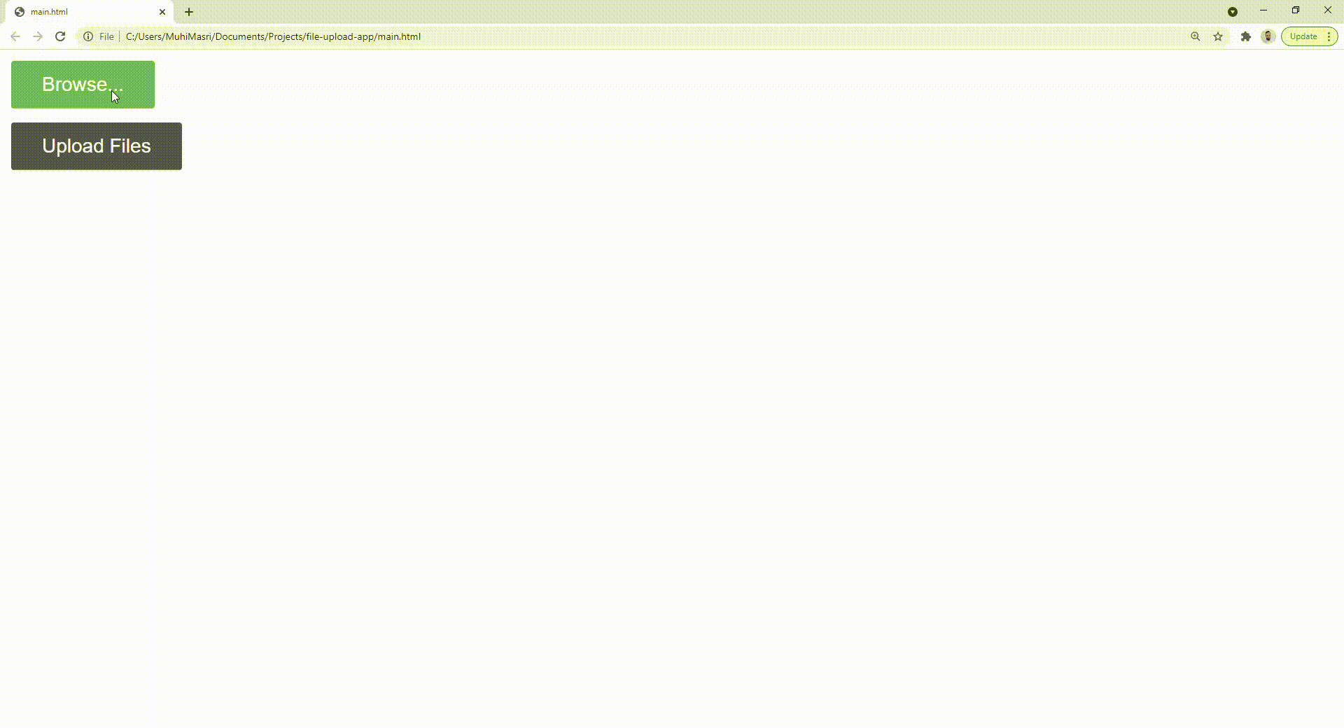
window.customElements.define('file-upload', FileUpload);In the main.html file, we can test it and add custom styles to two different instances of the upload-file component:
<!DOCTYPE html>
<html>
    <script src="./file-upload.js"></script>
    <style>
        file-upload::part(upload-button) {
            border: none;
            color: white;
            padding: 9px 22px;
            font-size: 14px;
            margin-bottom: 10px;
        }
        .upload1::part(upload-button) {background-color: #4CAF50;} /* Green */
        .upload2::part(upload-button) {background-color: #555555;} /* Black */
    </style>
    <body>
        <file-upload class="upload1"></file-upload>
        <file-upload class="upload2"></file-upload>
    </body>
</html>

Enable custom attributes
Just like Angular, Vue, or other libraries, we can pass props to a Web Component from the parent to trigger a certain custom behavior. In this example, we are adding a new upload-label attribute to allow the developer to change the text of the upload button.
observedAttributesgetter will enable a watcher on specified attributesattributeChangedCallbackfunction will update the DOM with the new value
// Create template
const template = document.createElement('template');
template.innerHTML = /*html*/`
  <style>
      :host {
        font-size: 13px;
        font-family: arial;
      }
      article {
          display: flex;
          align-items: center;
      }
      label {
        background-color: rgb(239, 239, 239);
        border: 1px solid rgb(118, 118, 118);
        padding: 2px 6px 2px 6px;
        border-radius: 2px;
        margin-right: 5px;
      }
      button {
          border:0;
          background: transparent;
          cursor: pointer;
      }
      button::before {
          content: '\\2716';
      }
  </style>
  <article>
    <label part="upload-button" for="fileUpload">Upload</label>
    <section hidden>
      <span></span><button></button>
    </section>
  </article>
  <input hidden id="fileUpload" type="file" />
`;

class FileUpload extends HTMLElement {
  constructor() {
    // Inititialize custom component
    super();
    this.attachShadow({ mode: 'open' });
    this.shadowRoot.appendChild(template.content.cloneNode(true));

    // Add event listeners
    this.select('input').onchange = (e) => this.handleChange(e);
    this.select('button').onclick = () => this.handleRemove();
  }

  handleChange(e) {
      const file = e.target.files[0];
      this.select('section').style.display = "block";
      this.select('span').innerText = file.name;
      this.dispatch('change', file);
  }

  handleRemove() {
    const el = this.select('input');
    const file = el.files[0];
    el.value = "";
    this.select('section').style.display = "none";
    this.dispatch('change', file);
  }

  static get observedAttributes() {
    return ['upload-label'];
  }

  attributeChangedCallback(name, oldValue, newValue) {
    if (name === 'upload-label') {
        if (newValue && newValue !== '') {
            this.select('label').innerText = newValue;
        }
    }
  }

  dispatch(event, arg) {
    this.dispatchEvent(new CustomEvent(event, {detail: arg}));
  }

  get select() {
    return this.shadowRoot.querySelector.bind(this.shadowRoot);
  }
}

window.customElements.define('file-upload', FileUpload);
Let’s update main.html file and try it out:
<!DOCTYPE html>
<html>
    <script src="./file-upload.js"></script>
    <style>
        file-upload::part(upload-button) {
            border: none;
            color: white;
            padding: 9px 22px;
            font-size: 14px;
            margin-bottom: 10px;
        }
        .upload1::part(upload-button) {background-color: #4CAF50;} /* Green */
        .upload2::part(upload-button) {background-color: #555555;} /* Black */
    </style>
    <body>
        <file-upload upload-label="Browse..." class="upload1"></file-upload>
        <file-upload upload-label="Upload Files" class="upload2"></file-upload>
    </body>
</html>

Conclusion
In this article, I wanted to demonstrate how you can use vanilla JavaScript to write a custom and framework agnostic file uploader that works everywhere. In most cases, I would typically use libraries such as Lit or Stencil. They provide a more declarative style of writing Web Components which will scale better and speed up the development process.
You can access the complete repository here.
Bye for now 👋


