Building a design system is a progressive and abstractive approach to maintaining a consistent and cost-efficient components library that follows a specific styling guide and is sharable across multiple products. A design system has always been associated with designers but now it’s becoming critical for frontend developers to understand it from the technology perspective.
In this article, I will share some of the tools I used to successfully build a design system in React. Of course, before building the library, we require the designer’s expertise to develop the brand’s look and feel, user experience, style guide, etc.
create-react-library
One of the essential parts of providing a design system library is to be able to have an independent React components solution that can be published and used by other projects.
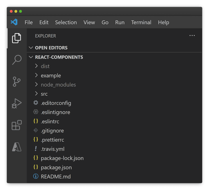
create-react-library is a CLI for creating reusable React libraries using Rollup and create-react-app. All you need to do is a simple global installation npm install -g create-react-library, then create-react-library, followed by few questions about your package and you have it all! A Boilerplate project for publishing React components.
srcfolder is where you develop and export components.examplefolder is for testing your components.
Material UI (MUI)
MUI can serve as a powerful base layer for your design system and can be easily customized to meet your component’s requirements.
Advantages of using MUI over building components from scratch:
- Built-in functionalities that will take a while to build from scratch, e.g. Dialogs, Autocomplete, Trees, Tables…
- Material is not only a library but a design system guide that helps you follow best design practices
- Responsive components that work on different devices
- Supported by Google
MUI uses Emotion as the base styling solution to style your application, but it also provides several other options such as plain CSS, Tailwind CSS, Styled Components… For more details, you can read the documentation on Style Library Interoperability.
Storybook
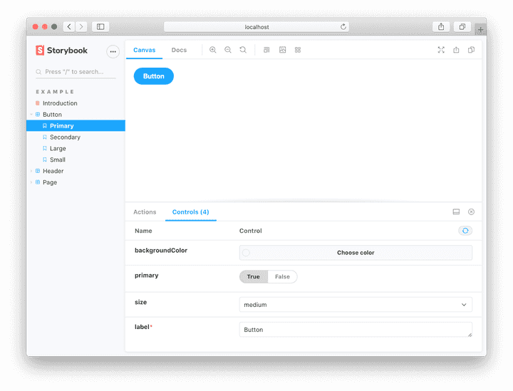
Storybook is a great tool for documenting, showcasing, and testing components with designers, managers, and developers. It allows you to create a story for each component that showcases different variants, behaviors, and features of your component.
Designers can provide feedback and updates while developers can test and learn how to work with your components.
Besides documentation, it has plenty of other useful features and plugins such as:
- Unit test functionality
- Accessibility testing
- Visual test appearance
Style Dictionary and Design Tokens:
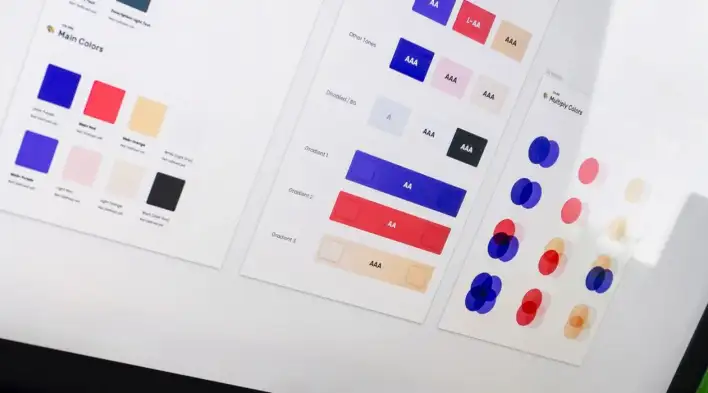
Design tokens are defined as all the values needed to construct and maintain a design system — spacing, color, typography, border, shadow, etc.
Style Dictionary enables you to create and organize all Design Tokens as variables in a JSON format and automatically transform it into any format like JS, SASS, XML (for Android), etc.
It is a powerful tool for both designers and developers. As a designer, you control all the design system values to ensure consistency, and as a developer, you don’t need to create and structure style variables for every project that follows the same style guide. As soon as there is a design update, the designer will change the value and it will reflect on all platforms. Awesome!
Takeaway
A design system is a hot topic and an integral part of many companies. Following the best practices to building a design system will ensure scalable and cost-efficient products.
Bye for now 👋


