


This series focuses on implementing new features to the Bootstrap Vue table component that enable users to edit data with dynamic and flexible schema.
BootstrapVue offers components with extensive features that can be used for almost any application. With the power of Vue, Bootstrap components can be easily extended and customized to meet your product’s requirements.
In this part, we’ll go through a step-by-step guide to how to customize a Bootstrap table to enable inline editing, on both row and cell levels. The end results will look and behave as follows:
Bootstrap Vue Table with inline row editing:
Bootstrap Vue Table with inline cell editing:
The object in red is a demonstration of two-way binding on the items being passed into the component. In real life, you would probably edit either a row or a cell but for the sake of this tutorial, we are doing both!
Vue setup
Create a new Vue app using Vue CLI.
npm install -g @vue/cli @vue/cli-service-global
vue create vue-editable-table
Bootstrap setup
Install both Bootstrap and Bootstrap Vue.
npm install bootstrap bootstrap-vueIn the main.js file, we will add the following code to make all Bootstrap components accessible everywhere.
import Vue from 'vue'
import App from './App.vue'
import { BootstrapVue, IconsPlugin } from 'bootstrap-vue'

// Import Bootstrap an BootstrapVue CSS files (order is important)
import 'bootstrap/dist/css/bootstrap.css'
import 'bootstrap-vue/dist/bootstrap-vue.css'

// Make BootstrapVue available throughout your project
Vue.use(BootstrapVue)
// Optionally install the BootstrapVue icon components plugin
Vue.use(IconsPlugin)

Vue.config.productionTip = false

new Vue({
  render: h => h(App),
}).$mount('#app')
Basic data table
VTable is the main component for creating data tables in Bootstrap. In the example below, we are passing it two props:
itemscontaining the list of objects for displaying data on the grid.fieldsthat defines the column’s schema (for now we only have key and label).labelis for specifying the name on the header andkeyis a unique id used by Bootstrap for custom cell slots, more on that later.
<template>
<div id="app">
<b-table :items="items" :fields="fields"></b-table>
</div>
</template>
<script>
export default {
name: "App",
components: {},
data() {
return {
fields: [
{ key: "name", label: "Name"},
{ key: "department", label: "Department" },
{ key: "age", label: "Age" },
{ key: "dateOfBirth", label: "Date Of Birth" },
],
items: [
{ age: 40, name: 'Dickerson', department: 'Development', dateOfBirth: '1984-05-20' },
{ age: 21, name: 'Larsen', department: 'Marketing', dateOfBirth: '1984-05-20' },
{ age: 89, name: 'Geneva', department: 'HR', dateOfBirth: '1984-05-20' },
{ age: 38, name: 'Jami', department: 'Accounting', dateOfBirth: '1984-05-20' }
],
};
},
};
</script>
<style>
#app {
text-align: center;
margin-top: 60px;
}
thead, tbody, tfoot, tr, td, th {
text-align: left;
}
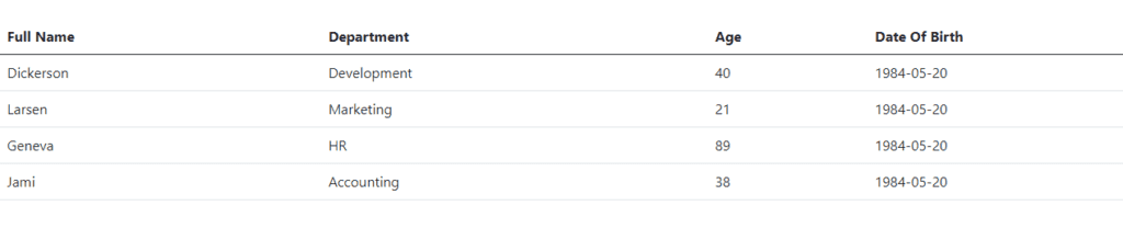
</style>Now when you run the project npm run serve, you should have a simple data table displayed on the screen:
Custom cells
VTable provides the option to replace any default field with our own custom component. They provide a slot name that looks and behaves like a function cell(key), this way we can pass the field key as an argument and VTable will know what cells to change.
Below, we are replacing every default cell with an input element (text, number, date, and select):
<template>
  <div id="app">
    <b-table :items="items" :fields="fields">
      <template #cell(name)="data">
          <b-form-input type="text" :value="data.value"></b-form-input>
      </template>
      <template #cell(department)="data">
        <b-form-select v-model="data.value" :options="['Development', 'Marketing', 'HR', 'Accounting']" class="form-control"></b-form-select>
      </template>
      <template #cell(age)="data">
          <b-form-input type="number" :value="data.value"></b-form-input>
      </template>
      <template #cell(dateOfBirth)="data">
        <b-form-datepicker v-model="data.value"></b-form-datepicker>
      </template>
    </b-table>
  </div>
</template>

<script>
export default {
  name: "App",
  components: {},
  data() {
    return {
      fields: [
        { key: "name", label: "Name"},
        { key: "department", label: "Department" },
        { key: "age", label: "Age" },
        { key: "dateOfBirth", label: "Date Of Birth" },
      ],
       items: [
          { age: 40, name: 'Dickerson', department: 'Development', dateOfBirth: '1984-05-20' },
          { age: 21, name: 'Larsen', department: 'Marketing', dateOfBirth: '1984-05-20' },
          { age: 89, name: 'Geneva', department: 'HR', dateOfBirth: '1984-05-20' },
          { age: 38, name: 'Jami', department: 'Accounting', dateOfBirth: '1984-05-20' }
        ],
    };
  },
};
</script>

<style>
#app {
  text-align: center;
  margin-top: 60px;
}
thead, tbody, tfoot, tr, td, th {
  text-align: left;
}
</style>
The slot returns data that contains the current row information (index, field, value…). For now, we are using data.value to bind data to the input fields.
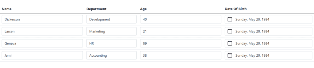
When refreshing the page, we should see all default cells replaced with input fields:
Inline row editing
So far, we were able to display data with customized cells and input fields, awesome job! In this step, we will make the row editable on demand. Upon clicking the edit button, the row will toggle between read-only and edit mode.
Let’s go through the required steps:
- Add a new “edit” object to the
fieldsarray, it will have an emptylabelas we don’t require a header name for the edit column. - Re-generate the
itemsmodel to include a newisEditproperty for every row. This will determine whether or not a row is in edit mode. - Every slot will have an
if elseblock that toggles between read-only and edit mode. - Add a new edit button slot with a click event that will modify the
isEdit. Also, it will toggle between “Edit” and “Done” label. - Finally,
:valuehas to be replaced with av-modelfor two-way binding. It will modify theitemsobject directly (e.g.v-model=items[data.index].name).
Below is the full code with a working example:
<template>
  <div id="app">
    <b-table :items="items" :fields="fields">
      <template #cell(name)="data">
          <b-form-input v-if="items[data.index].isEdit" type="text" v-model="items[data.index].name"></b-form-input>
          <span v-else>{{data.value}}</span>
      </template>
      <template #cell(department)="data">
        <b-form-select v-if="items[data.index].isEdit" v-model="items[data.index].department" :options="['Development', 'Marketing', 'HR', 'Accounting']"></b-form-select>
        <span v-else>{{data.value}}</span>
      </template>
      <template #cell(age)="data">
          <b-form-input v-if="items[data.index].isEdit" type="number" v-model="items[data.index].age"></b-form-input>
          <span v-else>{{data.value}}</span>
      </template>
      <template #cell(dateOfBirth)="data">
        <b-form-datepicker v-if="items[data.index].isEdit" v-model="items[data.index].dateOfBirth"></b-form-datepicker>
        <span v-else>{{data.value}}</span>
      </template>
      <template #cell(edit)="data">
        <b-button @click="editRowHandler(data)">
          <span v-if="!items[data.index].isEdit">Edit</span>
          <span v-else>Done</span>
        </b-button>
      </template>
    </b-table>
     <pre>
      {{items}}
    </pre>
  </div>
</template>

<script>
export default {
  name: "App",
  components: {},
  data() {
    return {
      fields: [
        { key: "name", label: "Name"},
        { key: "department", label: "Department" },
        { key: "age", label: "Age" },
        { key: "dateOfBirth", label: "Date Of Birth" },
        { key: 'edit', label: ''}
      ],
       items: [
          { age: 40, name: 'Dickerson', department: 'Development', dateOfBirth: '1984-05-20' },
          { age: 21, name: 'Larsen', department: 'Marketing', dateOfBirth: '1984-05-20' },
          { age: 89, name: 'Geneva', department: 'HR', dateOfBirth: '1984-05-20' },
          { age: 38, name: 'Jami', department: 'Accounting', dateOfBirth: '1984-05-20' }
        ],
    };
  },
  mounted() {
      this.items = this.items.map(item => ({...item, isEdit: false}));
  },
  methods: {
      editRowHandler(data) {
        this.items[data.index].isEdit = !this.items[data.index].isEdit;
      }
    }
  }
</script>

<style>
#app {
  text-align: center;
  margin: 60px;
}
thead, tbody, tfoot, tr, td, th {
  text-align: left;
  width: 100px;
  vertical-align: middle;
}
pre {
  text-align: left;
  color: #d63384;
}
</style>Inline cell editing
An alternative approach to editing a row is to edit an individual cell. Here are the steps for supporting inline cell editing:
- Add a new string data called
selectedCellto determine which cell is currently selected. - Update the slot condition to check for both
isEditand theselectedCell. E.g.v-if="items[data.index].isEdit && selectedCell === 'name'". - The click event should be added on the cell element instead of the edit button and the handler function will update both the
selectedCellandisEdit. Also, we can now remove the edit button slot as it’s not required anymore.
Below is the full code with a working example:
<template>
  <div id="app">
    <b-table :items="items" :fields="fields">
      <template #cell(name)="data">
          <b-form-input v-if="items[data.index].isEdit && selectedCell === 'name'" type="text" v-model="items[data.index].name"></b-form-input>
          <span v-else @click="editCellHandler(data, 'name')">{{data.value}}</span>
      </template>
      <template #cell(department)="data">
        <b-form-select v-if="items[data.index].isEdit && selectedCell === 'department'" v-model="items[data.index].department" :options="['Development', 'Marketing', 'HR', 'Accounting']" class="form-control"></b-form-select>
        <span v-else @click="editCellHandler(data, 'department')">{{data.value}}</span>
      </template>
      <template #cell(age)="data">
          <b-form-input v-if="items[data.index].isEdit && selectedCell === 'age'" type="number" v-model="items[data.index].age"></b-form-input>
          <span v-else @click="editCellHandler(data, 'age')">{{data.value}}</span>
      </template>
      <template #cell(dateOfBirth)="data">
        <b-form-datepicker v-if="items[data.index].isEdit && selectedCell === 'dateOfBirth'" v-model="items[data.index].dateOfBirth"></b-form-datepicker>
        <span v-else @click="editCellHandler(data, 'dateOfBirth')">{{data.value}}</span>
      </template>
    </b-table>
     <pre>
      {{items}}
    </pre>
  </div>
</template>

<script>
export default {
  name: "App",
  components: {},
  data() {
    return {
      fields: [
        { key: "name", label: "Name"},
        { key: "department", label: "Department" },
        { key: "age", label: "Age" },
        { key: "dateOfBirth", label: "Date Of Birth" },
        { key: 'edit', label: ''}
      ],
       items: [
          { age: 40, name: 'Dickerson', department: 'Development', dateOfBirth: '1984-05-20' },
          { age: 21, name: 'Larsen', department: 'Marketing', dateOfBirth: '1984-05-20' },
          { age: 89, name: 'Geneva', department: 'HR', dateOfBirth: '1984-05-20' },
          { age: 38, name: 'Jami', department: 'Accounting', dateOfBirth: '1984-05-20' }
        ],
        selectedCell: null
    };
  },
  mounted() {
      this.items = this.items.map(item => ({...item, isEdit: false}));
  },
  methods: {
      editCellHandler(data, name) {
        this.items = this.items.map(item => ({...item, isEdit: false}));
        this.items[data.index].isEdit = true;
        this.selectedCell = name
      }
    }
  }
</script>

<style>
#app {
  text-align: center;
  margin: 60px;
}
thead, tbody, tfoot, tr, td, th {
  text-align: left;
  width: 100px;
  vertical-align: middle;
}
pre {
  text-align: left;
  color: #d63384;
}
</style>
Notice, at the beginning of the function, we’re resetting isEdit to false for all rows to restrict editing one cell at a time.
this.items = this.items.map(item => ({...item, isEdit: false}));Summary
If you made it to this section, pat yourself on the back! You just learned how to:
- Setup a Vue and Bootstrap project
- Create a basic data table
- Enable inline row and cell editing
You can access the complete repository here.
Bye for now 👋

