


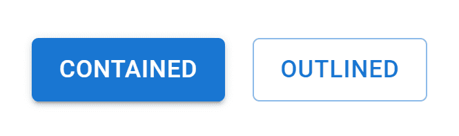
variant is a built-in property used in MUI components. Its primary usage is to provide different look and feel options to fulfill the products’ branding and design. For example, a Button can have an “outlined” or “contained” variant.
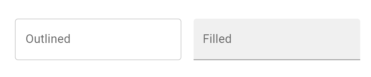
Or a Text Field can have an “outlined” or “filled” variant.
In this article, we’ll learn how to create a custom variant and override an existing one. We’ll use the Button component as an example, but a variant prop is also available in the Text Field and other components.
If you’d like to skip all the details, below is the complete code example:
If this is your first time working with MUI, please follow the installation instructions from the official documentation to get started.
Override a variant
creatTheme provides specific component customization using the styleOverrides key. Then we can add the component and variant we’re trying to customize, in our case, MuiButton and container.
import { ThemeProvider, createTheme } from "@mui/material/styles";
import { Button } from "@mui/material";
const theme = createTheme({
components: {
MuiButton: {
styleOverrides: {
contained: {
padding: "10px 20px",
fontSize: "16px",
fontWeight: "500"
}
}
}
}
});
export default function App() {
return (
<ThemeProvider theme={theme}>
<Button variant="contained">contained</Button>
</ThemeProvider>
);
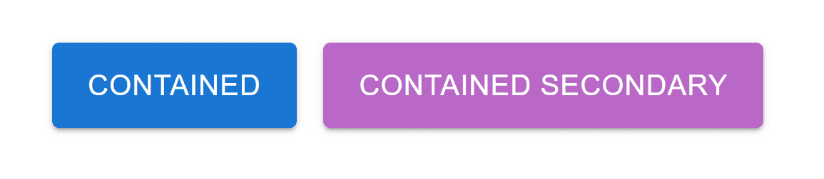
}We can even be more selective and customize the variant with a specific color (e.g., primary or secondary).
import { ThemeProvider, createTheme } from "@mui/material/styles";
import { Button } from "@mui/material";
import { purple } from "@mui/material/colors";
const theme = createTheme({
  components: {
    MuiButton: {
      styleOverrides: {
        contained: {
          padding: "10px 20px",
          fontSize: "16px",
          fontWeight: "500"
        },
        containedSecondary: {
          background: purple[300]
        }
      }
    }
  }
});
export default function App() {
  return (
    <ThemeProvider theme={theme}>
      <Button variant="contained">contained</Button>
      <Button variant="contained" color="secondary">
        contained secondary
      </Button>
    </ThemeProvider>
  );
}
Here are the new updated styles:
Create a new variant
Similar to the first section, we’ll need to customize MuiButton but this time using the variants key to add and style a custom one.
Let’s create a new variant that adds a gradient to the background color.
import { ThemeProvider, createTheme } from "@mui/material/styles";
import { Button } from "@mui/material";
import { blue } from "@mui/material/colors";
const theme = createTheme({
components: {
MuiButton: {
variants: [
{
props: { variant: "gradient" },
style: {
background: `linear-gradient(45deg, ${blue[700]} 35%, ${blue[300]} 90%)`,
color: "#fff"
}
}
]
}
}
});
export default function App() {
return (
<ThemeProvider theme={theme}>
<Button variant="gradient">primary gradient</Button>
</ThemeProvider>
);
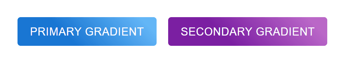
}As seen above, when adding a custom variant, we can name and style the variant however we see fit. Additionally, props has a color option that we can use to style the variant with a specific color palette. Let’s try it for both primary and secondary colors.
import { ThemeProvider, createTheme } from "@mui/material/styles";
import { Button } from "@mui/material";
import { blue, purple } from "@mui/material/colors";

const theme = createTheme({
  components: {
    MuiButton: {
      variants: [
        {
          props: { variant: "gradient", color: "primary" },
          style: {
            background: `linear-gradient(45deg, ${blue[700]} 35%, ${blue[300]} 90%)`,
            color: "#fff"
          }
        },
        {
          props: { variant: "gradient", color: "secondary" },
          style: {
            background: `linear-gradient(45deg, ${purple[700]} 35%, ${purple[300]} 90%)`,
            color: "#fff"
          }
        }
      ]
    }
  }
});
export default function App() {
  return (
    <ThemeProvider theme={theme}>
      <Button variant="gradient">primary gradient</Button>
      <Button variant="gradient" color="secondary">
        secondary gradient
      </Button>
    </ThemeProvider>
  );
}
Summary
variant is a very useful option that MUI provides out of the box, and with the latest MUI 5 version, the team has done a fantastic job of making the theme more extensible and easier to customize.
Bye for now 👋


