


In this article I’d like to share with you how to create a reusable custom checkbox element using CSS and VueJS. Most of us are used to having custom UI elements out of the box when using Bootstrap, Material or other libraries but in my recent project I was asked not to use any of the UI libraries. So I accepted the challenge, rolled up my sleeves and went right into it 💪
The goal here is to change the styling of the checkbox using pure CSS (with SCSS support) and enable color customization for developers

Initialize a Vue app with a checkbox component
We will use Vue CLI to setup and create a new project. If you already have Vue CLI installed and don’t want to start a new project you can skip this part.
npm install -g @vue/cli
vue create vue-custom-checkbox
When creating a new Vue project, choosing the default settings will enable SCSS out of the box.
Now, let’s create an empty checkbox component with SCSS enabled for styling.
<template>
</template>
<script>
export default {}
</script>
<style lang="scss">
</style>
Customize HTML
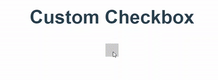
Add the required HTML elements to customize a checkbox.
<template>
  <label>
    <input type="checkbox" />
    <span></span>
  </label>
</template>
<script>
export default {};
</script>
<style lang="scss">
</style>
As you’ve already noticed, everything is wrapped in a label element to enable the input to react when clicking anywhere within that region. The label element has a built in feature that can automatically toggles the input within it. The span will be used to customize and replace the look and feel of the native html input.
Customize CSS
The trick here is to hide the input but still make use of the checked attribute to toggle the style change of the span whenever the state is checked or unchecked. Below is a basic code that triggers the span style change as we click on the label
<template>
  <label>
    <input type="checkbox" />
    <span></span>
  </label>
</template>
<script>
export default {};
</script>
<style lang="scss">
:root {
  span {
    width: 15px;
    height: 15px;
    border: 1px solid #cccccc;
    display: inline-block;
  }
  input {
    display: none;
    &:checked ~ span {
      background: #cccccc;
    }
  }
}
</style>
Simply all what we did is hide the input using display:none and when the attribute is checked, we change the span background color. Notice that we are using the ”~” operator and it means selecting the sibling. Since span is not a child element of input, we need to let CSS know to change the element right next to the input rather than the child (which is the default behavior).
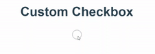
Awesome! Now that we understand how to replace the native input with a span, let’s have some fun and make it look good 🙂
Below is the code for styling it as a circle with a check mark:
<template>
  <label>
    <input type="checkbox" />
    <span></span>
  </label>
</template>
<script>
export default {
  name: 'c-checkbox',
};
</script>
<style lang="scss">
:root {
  label {
    position: relative;
  }
  span {
    width: 16px;
    height: 16px;
    border: 1px solid #ccc;
    display: inline-block;
    border-radius: 50%;
    transition: all linear 0.3s;
    &:after {
      content: "";
      position: absolute;
      top: -1px;
      left: 6px;
      border-bottom: 2px solid #fff;
      border-right: 2px solid #fff;
      height: 9px;
      width: 4px;
      transform: rotate(45deg);
      visibility: hidden;
    }
  }
  input {
    display: none;
    &:checked ~ span {
      background: #ccc;
      &:after {
        visibility: visible;
      }
    }
  }
}
</style>
Quick summary:
- Change the span to a circle by adding a radius 50%.
- Use
::afterselector to add content (check mark) within the span element. It will be initially set to visibility:hidden until the element is checked. - Create a check mark by making half a rectangle then rotating it 45 degrees using transform:rotate.
- Finally, when the input is checked, change span:after visibility to visible.
- The rest is just fine tuning work including some transition to improve the UX.
Enable data binding
In many scenarios, the checkbox is used in a form where you need to use v-model for two way binding. To be able to make our custom component work with v-model, we simply need to emit the ‘input’ event with the current checked value.
<input type="checkbox" @change="$emit('input', $event.target.checked)" />Now let’s test data binding in the main home page. We will create a reactive value and attach it to the v-model. Then, display it anywhere on the screen to validate data change when checkbox is toggled.
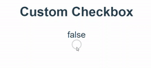
<template>
    <main>
        <h2>Custom Checkbox</h2>
        <div>{{ checkedValue }}</div>
        <c-checkbox v-model="checkedValue"></c-checkbox>
    </main>
</template>
<script>
import CCheckbox from '@/components/c-checkbox.vue';
import { ref } from '@vue/composition-api';
export default {
  components: {
    CCheckbox,
  },
  setup() {
    const checkedValue = ref(false);
    return { checkedValue };
  },
};
</script>
<style lang="scss">
</style>
Notice that we are using ref(false) and a setup function. This is from Vue’s new composition api. You can learn more about it in the official site’s documentation.
Enable color customization
Of course, one of the main reasons why we create encapsulated UI components is to make it reusable, modular and customizable all across the project (or multiple projects).
Let’s suppose that the developer who is using the component requires to apply different colors in certain scenarios. There are multiple ways to achieve this but today we will explore CSS variables.
First, we have three places in our code that requires changes:
- Checkbox border color
- Checkbox background color (when checked)
- Check mark color
Let’s go ahead and declare variables with default colors at the root of our component. Line 14 and 15.
<template>
  <label>
    <input type="checkbox" @change="$emit('input', $event.target.checked)" />
    <span></span>
  </label>
</template>
<script>
export default {
  name: 'c-checkbox',
};
</script>
<style lang="scss">
:root {
  --checkbox-color: grey;
  --checkmark-color: white;
  label {
    position: relative;
  }
  span {
    width: 16px;
    height: 16px;
    border: 1px solid #ccc;
    display: inline-block;
    border-radius: 50%;
    transition: all linear 0.3s;
    &:after {
      content: "";
      position: absolute;
      top: -1px;
      left: 6px;
      border-bottom: 2px solid #fff;
      border-right: 2px solid #fff;
      height: 9px;
      width: 4px;
      transform: rotate(45deg);
      visibility: hidden;
    }
  }
  input {
    display: none;
    &:checked ~ span {
      background: #ccc;
      &:after {
        visibility: visible;
      }
    }
  }
}
</style>
Then, let’s replace line 22, 32, 33 and 43 with the appropriate variables.
<template>
  <label>
    <input type="checkbox" @change="$emit('input', $event.target.checked)" />
    <span></span>
  </label>
</template>
<script>
export default {
  name: 'c-checkbox',
};
</script>
<style lang="scss">
:root {
  --checkbox-color: grey;
  --checkmark-color: white;
  label {
    position: relative;
  }
  span {
    width: 16px;
    height: 16px;
    border: 1px solid var(--checkbox-color);
    display: inline-block;
    border-radius: 50%;
    transition: all linear 0.3s;
    &:after {
      content: "";
      position: absolute;
      top: -1px;
      left: 6px;
      border-bottom: 2px solid var(--checkmark-color);
      border-right: 2px solid var(--checkmark-color);
      height: 9px;
      width: 4px;
      transform: rotate(45deg);
      visibility: hidden;
    }
  }
  input {
    display: none;
    &:checked ~ span {
      background: var(--checkbox-color);
      &:after {
        visibility: visible;
      }
    }
  }
}
</style>
Finally, let’s create multiple checkbox components in the home page and assign each different colors.
<template>
  <main>
    <h2>Custom Checkbox</h2>
    <div>{{ checkedValue }}</div>
    <c-checkbox v-model="checkedValue"></c-checkbox>
    <section>
      <c-checkbox class="checkbox-1"></c-checkbox>
      <c-checkbox class="checkbox-2"></c-checkbox>
      <c-checkbox class="checkbox-3"></c-checkbox>
      <c-checkbox class="checkbox-4"></c-checkbox>
    </section>
  </main>
</template>
<script>
import CCheckbox from '@/components/c-checkbox.vue';
import { ref } from '@vue/composition-api';
export default {
  components: {
    CCheckbox,
  },
  setup() {
    const checkedValue = ref(false);
    return { checkedValue };
  },
};
</script>
<style lang="scss">
:root {
  label {
    margin-right: 5px;
  }
  .checkbox-1 {
    --checkbox-color: gainsboro;
  }
  .checkbox-2 {
    --checkbox-color: lightpink;
    --checkmark-color: black;
  }
  .checkbox-3 {
    --checkbox-color: paleturquoise;
  }
  .checkbox-4 {
    --checkbox-color: greenyellow;
    --checkmark-color: purple;
  }
}
</style>
Demo
You can access the complete repository here.
Bye for now 👋


