


Form dialogs are very common and useful especially when you don’t want to redirect the user to a separate page. A common example would be a newsletter subscription dialog, whether or not users choose to subscribe, they shouldn’t have to navigate back to the initial page.
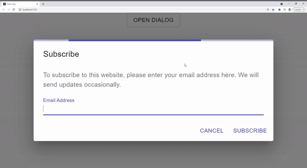
A good practice is to trigger a loading bar as soon as the user submits a request to the server. Here is an example I created using Material Linear Progress:
But what if we have other form dialogs in a project that requires to behave the same way? In this article, I will go through a step-by-step guide to creating a reusable custom dialog that inherits from React Material and extends functionality to include a built-in loading bar. This way, we have a consistent experience in every dialog without any redundancies.
Setup React Project
Create React App and install React Material
npx create-react-app react-material-dialog
npm install @material-ui/core
Create a Custom Dialog
Let’s create a new Dialog.js component that inherits from Material Dialog and uses a LinearProgress component.
import { LinearProgress } from '@material-ui/core';
import MatDialog from '@material-ui/core/Dialog';

export const Dialog = ({children, ...props}) => {
    return (
        <MatDialog {...props}>
            <LinearProgress></LinearProgress>
            {children}
        </MatDialog>
    )
}
We placed the LinearProgress as the first element within MatDialog followed by the children that will eventually be passed by the consumer. Also, …props should go into MatDialog in order to access all the component’s features (such as open, onClose, aria…).
The reason why I’m importing Material Dialog as MatDialog to not to cause naming conflict with the custom dialog.js we just created
Test Loading Bar
In the main App.js component, let’s try out the custom dialog we just created and check if the loading bar is showing. We will use one of the form dialog examples from React Material but instead of importing the dialog from @material-ui/core will import the custom one ./Dialog
import { useState } from 'react';
import './App.css';
import { Button, DialogTitle, DialogContent, DialogContentText, TextField, DialogActions } from '@material-ui/core';
import { Dialog } from './Dialog'

function App() {
  const [open, setOpen] = useState(false);
  const handleClose = () => {
    setOpen(false);
  };
  return (
    <div className="App">
      <Button onClick={() => setOpen(true)}>Open</Button>
      <Dialog open={open} onClose={handleClose} aria-labelledby="form-dialog-title">
        <DialogTitle id="form-dialog-title">Subscribe</DialogTitle>
        <DialogContent>
          <DialogContentText>
            To subscribe to this website, please enter your email address here. We will send updates
            occasionally.
          </DialogContentText>
          <TextField
            autoFocus
            margin="dense"
            id="name"
            label="Email Address"
            type="email"
            fullWidth
          />
        </DialogContent>
        <DialogActions>
          <Button onClick={handleClose} color="primary">
            Cancel
          </Button>
          <Button onClick={handleClose} color="primary">
            Subscribe
          </Button>
        </DialogActions>
      </Dialog>
    </div>
  );
}

export default App;
@muhimasri
Create Conditional Loading
As we can see above, the current component is not complete as the loading bar shows all the time.
We can easily adjust this by adding a new loading prop that can be passed by the consumer. It will indicate when to trigger the loading:
import { LinearProgress } from '@material-ui/core';
import MatDialog from '@material-ui/core/Dialog';

export const Dialog = ({loading, children, ...props}) => {
    return (
        <MatDialog {...props}>
            {loading ? <LinearProgress></LinearProgress> : null}
            {children}
        </MatDialog>
    )
}
Now that we have the full component ready and it accepts a loading prop, let’s trigger the loading bar upon submitting the form. We will including a timeout function to mimic an API call and then close the dialog:
import { useState } from 'react';
import './App.css';
import { Button, DialogTitle, DialogContent, DialogContentText, TextField, DialogActions } from '@material-ui/core';
import { Dialog } from './Dialog'
function App() {
const [open, setOpen] = useState(false);
const [loading, setLoading] = useState(false);
const handleClose = () => {
setOpen(false);
};
const handleSubscribe = () => {
setLoading(true);
setTimeout(() => {
setLoading(false);
setOpen(false);
}, 2000)
}
return (
<div className="App">
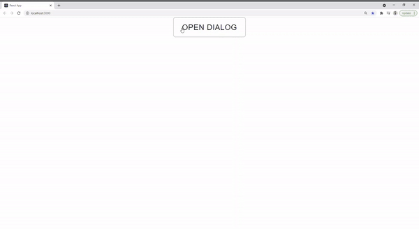
<Button variant="outlined" onClick={() => setOpen(true)}>Open Dialog</Button>
<Dialog loading={loading} open={open} onClose={handleClose} aria-labelledby="form-dialog-title">
<DialogTitle id="form-dialog-title">Subscribe</DialogTitle>
<DialogContent>
<DialogContentText>
To subscribe to this website, please enter your email address here. We will send updates
occasionally.
</DialogContentText>
<TextField
autoFocus
margin="dense"
id="name"
label="Email Address"
type="email"
fullWidth
/>
</DialogContent>
<DialogActions>
<Button onClick={handleClose} color="primary">
Cancel
</Button>
<Button onClick={handleSubscribe} color="primary">
Subscribe
</Button>
</DialogActions>
</Dialog>
</div>
);
}
export default App;
And you’re all done! Now, anytime you have a form dialog, all you need to do is to use the new custom dialog and pass it the loading prop.
You can access the complete repository here.
Bye for now 👋


