


In this article, we’re going to learn and apply some useful loading techniques using Material UI and React components.
If you’d like to jump right into the code without a step-by-step guide, below is the final interactive demo on CodeSandbox. Clicking on each button will trigger a different loading style:
Install MUI
npm install @mui/material @emotion/react @emotion/styledEmotion library is required if you prefer creating React components that have styles attached to them.
Add Page Content
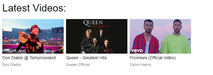
Let’s start with adding some content to make the loading feel and behave like a real-world app.
We’ll create a Content component that displays a title with three cards. The data is coming from a static JSON object at the beginning of the code:
import "./styles.css";
import Grid from "@mui/material/Grid";
import Box from "@mui/material/Box";
import Typography from "@mui/material/Typography";

const data = [
  {
    src:
      "https://i.ytimg.com/vi/pLqipJNItIo/hqdefault.jpg?sqp=-oaymwEYCNIBEHZIVfKriqkDCwgBFQAAiEIYAXAB&rs=AOn4CLBkklsyaw9FxDmMKapyBYCn9tbPNQ",
    title: "Don Diablo @ Tomorrowland",
    channel: "Don Diablo"
  },
  {
    src:
      "https://i.ytimg.com/vi/_Uu12zY01ts/hqdefault.jpg?sqp=-oaymwEZCPYBEIoBSFXyq4qpAwsIARUAAIhCGAFwAQ==&rs=AOn4CLCpX6Jan2rxrCAZxJYDXppTP4MoQA",
    title: "Queen - Greatest Hits",
    channel: "Queen Official"
  },
  {
    src:
      "https://i.ytimg.com/vi/kkLk2XWMBf8/hqdefault.jpg?sqp=-oaymwEYCNIBEHZIVfKriqkDCwgBFQAAiEIYAXAB&rs=AOn4CLB4GZTFu1Ju2EPPPXnhMZtFVvYBaw",
    title: "Promises (Official Video)",
    channel: "Calvin Harris"
  }
];

export default function App() {
  return (
    <Box>
      <Content />
    </Box>
  );
}

const Content = () => (
  <Box sx={{ p: 1 }}>
    <Typography variant="h4">Loading Techniques</Typography>
    <Grid container wrap="nowrap">
      {data.map((item, index) => (
        <Box key={index} sx={{ width: 210, marginRight: 1, my: 2 }}>
          <img
            style={{ width: 210, height: 118 }}
            alt={item.title}
            src={item.src}
          />
          <Box sx={{ pr: 2 }}>
            <Typography gutterBottom variant="body2">
              {item.title}
            </Typography>
            <Typography
              display="block"
              variant="caption"
              color="text.secondary"
            >
              {item.channel}
            </Typography>
          </Box>
        </Box>
      ))}
    </Grid>
  </Box>
);
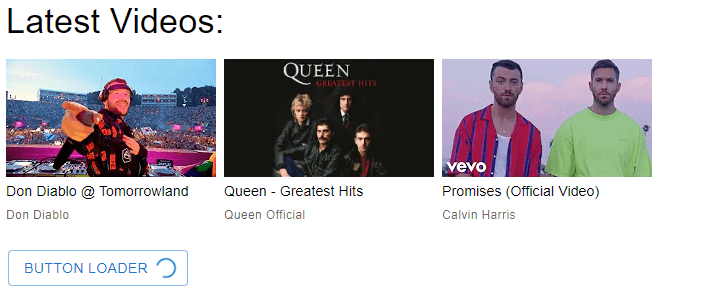
Button Circular Loading
MUI Button provides an option to add an icon or any component to either side of the button. In our case, we’ll add a CircularProgress component at the end of the button element and modify the size to make it fit evenly:
import "./styles.css";
import Grid from "@mui/material/Grid";
import Box from "@mui/material/Box";
import Typography from "@mui/material/Typography";
import Button from "@mui/material/Button";
import CircularProgress from "@mui/material/CircularProgress";

const data = [...];

export default function App() {
  return (
    <Box>
      <Content />
      <Button endIcon={<CircularProgress size={20} />} variant="outlined">
        Button Loader
      </Button>
    </Box>
  );
}

const Content = () => (
  <Box sx={{ p: 1 }}>
    <Typography variant="h4">Loading Techniques</Typography>
    <Grid container wrap="nowrap">
      {data.map((item, index) => (
        <Box key={index} sx={{ width: 210, marginRight: 1, my: 2 }}>
          <img
            style={{ width: 210, height: 118 }}
            alt={item.title}
            src={item.src}
          />
          <Box sx={{ pr: 2 }}>
            <Typography gutterBottom variant="body2">
              {item.title}
            </Typography>
            <Typography
              display="block"
              variant="caption"
              color="text.secondary"
            >
              {item.channel}
            </Typography>
          </Box>
        </Box>
      ))}
    </Grid>
  </Box>
);
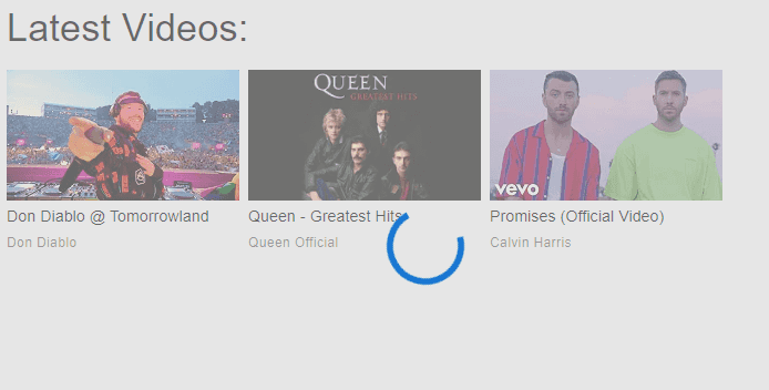
Page Circular Loading
In this example, we’re going to use the same CircularProgress component but position it in the center of the page. Additionally, we’re adding a layer that greys out the background and disable any interactions with the page:
import "./styles.css";
import Grid from "@mui/material/Grid";
import Box from "@mui/material/Box";
import Typography from "@mui/material/Typography";
import CircularProgress from "@mui/material/CircularProgress";
import { styled } from "@mui/system";

const data = [...];

export default function App() {
  return (
    <Box>
      <CircularLoading />
      <Content />
    </Box>
  );
}

const DisabledBackground = styled(Box)({
  width: "100%",
  height: "100%",
  position: "fixed",
  background: "#ccc",
  opacity: 0.5,
  zIndex: 1
});

const CircularLoading = () => (
  <>
    <CircularProgress
      size={70}
      sx={{
        position: "fixed",
        left: "50%",
        top: "50%",
        transform: "translate(-50%, -50%)",
        zIndex: 2
      }}
    />
    <DisabledBackground />
  </>
);

const Content = () => (
  <Box sx={{ p: 1 }}>
    <Typography variant="h4">Latest Videos:</Typography>
    <Grid container wrap="nowrap">
      {data.map((item, index) => (
        <Box key={index} sx={{ width: 210, marginRight: 1, my: 2 }}>
          <img
            style={{ width: 210, height: 118 }}
            alt={item.title}
            src={item.src}
          />
          <Box sx={{ pr: 2 }}>
            <Typography gutterBottom variant="body2">
              {item.title}
            </Typography>
            <Typography
              display="block"
              variant="caption"
              color="text.secondary"
            >
              {item.channel}
            </Typography>
          </Box>
        </Box>
      ))}
    </Grid>
  </Box>
);
Notice that we created DisabledBackground as a separate component as it will be re-used in the next section.
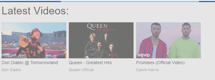
Page Linear Progress Loading
This is very similar to the previous example except we are using the LinearProgress component without any custom positioning:
import "./styles.css";
import Grid from "@mui/material/Grid";
import Box from "@mui/material/Box";
import Typography from "@mui/material/Typography";
import LinearProgress from "@mui/material/LinearProgress";
import { styled } from "@mui/system";

const data = [...];

export default function App() {
  return (
    <Box>
      <LinearLoading />
      <Content />
    </Box>
  );
}

const DisabledBackground = styled(Box)({
  width: "100%",
  height: "100%",
  position: "fixed",
  background: "#ccc",
  opacity: 0.5,
  zIndex: 1
});

const LinearLoading = () => (
  <>
    <LinearProgress sx={{ zIndex: 2 }} />
    <DisabledBackground />
  </>
);

const Content = () => (
  <Box sx={{ p: 1 }}>
    <Typography variant="h4">Latest Videos:</Typography>
    <Grid container wrap="nowrap">
      {data.map((item, index) => (
        <Box key={index} sx={{ width: 210, marginRight: 1, my: 2 }}>
          <img
            style={{ width: 210, height: 118 }}
            alt={item.title}
            src={item.src}
          />
          <Box sx={{ pr: 2 }}>
            <Typography gutterBottom variant="body2">
              {item.title}
            </Typography>
            <Typography
              display="block"
              variant="caption"
              color="text.secondary"
            >
              {item.channel}
            </Typography>
          </Box>
        </Box>
      ))}
    </Grid>
  </Box>
);
Skeleton Loading
Skeleton loading is a technique used to provide a better user experience while waiting for content to be loaded, especially when a bunch of different components is being loaded in parallel.
Luckily, MUI provides a dedicated component API for creating any skeleton styles we need. In our case, we’re going to mimic the title and cards from the Content component as follows:
import "./styles.css";
import Grid from "@mui/material/Grid";
import Box from "@mui/material/Box";
import Typography from "@mui/material/Typography";
import Skeleton from "@mui/material/Skeleton";

export default function App() {
  return (
    <Box>
      <SkeletonLoading />
    </Box>
  );
}

const SkeletonLoading = () => (
  <Box sx={{ p: 1 }}>
    <Typography variant="h4">
      <Skeleton width="30%" />
    </Typography>
    <Grid container wrap="nowrap">
      {Array.from(new Array(3)).map((item, index) => (
        <Box key={index} sx={{ width: 210, marginRight: 1, my: 2 }}>
          <Skeleton variant="rectangular" width={210} height={118} />
          <Box sx={{ pt: 0.5 }}>
            <Skeleton />
            <Skeleton width="60%" />
          </Box>
        </Box>
      ))}
    </Grid>
  </Box>
);
We used the same HTML structure and layout but with Skeleton components instead of images and titles.

Take a way
Those examples are just some of the many amazing loading techniques that can be used from MUI. I highly suggest going through the documentation to explore other options that might be useful for your application.
Bye for now 👋


