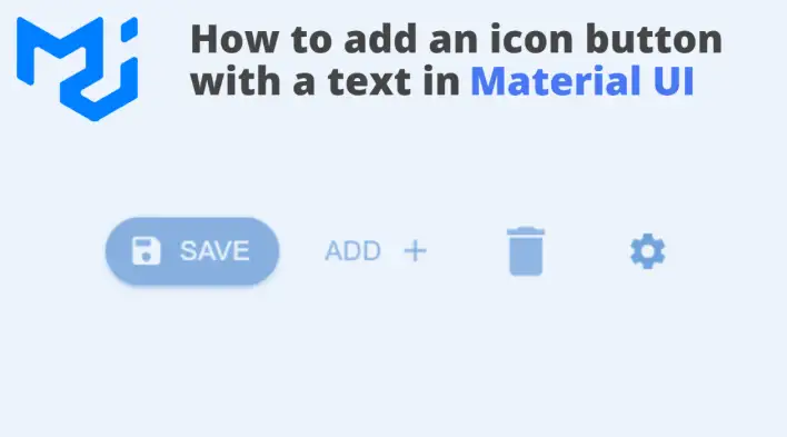
In this tutorial, we will learn how to create a React icon button using Material UI. In particular, we will cover two different techniques for adding an icon to a Material UI button. Below is the complete working code:
As you can see in the above example, we have four different buttons:
- The first two are very similar, a button with an icon and a text, except each button has the icon in a different position.
- The last two are just icons with no label or text but they are still made of a button element. If we inspect the element, we can see it as a button with an SVG icon as a child element. That’s why it still has the cool ripple effect (a built-in effect from the Material UI)
Let’s get started with building icon button components:
Install MUI
npm install @mui/material @mui/icons-material @emotion/react @emotion/styledEmotion library is required to create React components that have styles attached to them.
Create an MUI Icon Button without text
We can import and use an already made Material UI icon button component called IconButton in the main App component. It’s made specifically to create an icon button with no text or label:
import IconButton from "@mui/material/IconButton";

export default function App() {
  return (
    <div>
      <IconButton></IconButton>
    </div>
  );
}
Initially, we won’t see anything because it requires us to specify the icon. MUI has a list of icons we can choose from; click here to see the complete list. We can pick the delete icon for this example and include it within the IconButton component:
import IconButton from "@mui/material/IconButton";
import DeleteIcon from '@mui/icons-material/Delete';

export default function App() {
  return (
    <div>
      <IconButton>
        <DeleteIcon />
      </IconButton>
    </div>
  );
}
Now we should have the delete icon button showing correctly on the screen.
To change the size or other styles, we can make use of the IconButton API and Icon API:
import IconButton from "@mui/material/IconButton";
import DeleteIcon from '@mui/icons-material/Delete';

export default function App() {
  return (
    <div>
      <IconButton size="large">
        <DeleteIcon fontSize="large" />
      </IconButton>
    </div>
  );
}
We have to use both size and fontSize props because the IconButton will only change the size of the button but not the SVG font size.
Create an MUI icon button with text
To create an icon button with a text, we can use a standard button component along with a startIcon or endIcon prop, which is available as part of the button API. The prop value accepts any Material UI icon. Let’s add a save icon followed by a “Save” text:
import IconButton from "@mui/material/IconButton";
import DeleteIcon from '@mui/icons-material/Delete';
import SaveIcon from '@mui/icons-material/Save';
import { Button } from "@mui/material";

export default function App() {
  return (
    <div>
      <Button startIcon={<SaveIcon />}>Save</Button>
      <IconButton size="large">
        <DeleteIcon fontSize="large" />
      </IconButton>
    </div>
  );
}
Customizing and styling is similar to the IconButton we did earlier. For this specific example, we can use the sx prop, which allows us to specify any valid CSS. Let’s change the radius to 10 pixels and make it “contained”.
import IconButton from "@mui/material/IconButton";
import DeleteIcon from "@mui/icons-material/Delete";
import SaveIcon from "@mui/icons-material/Save";
import { Button } from "@mui/material";

export default function App() {
  return (
    <div>
      <Button
        sx={{ borderRadius: 10 }}
        variant="contained"
        startIcon={<SaveIcon />}
      >
        Save
      </Button>
      <IconButton size="large">
        <DeleteIcon fontSize="large" />
      </IconButton>
    </div>
  );
}
Lastly, we can tidy things up by encapsulating the new button customization in one component to reuse it anywhere in our project. So let’s create a new one with all the changes we just did and then import it into the main app.
import SaveIcon from "@mui/icons-material/Save";
import { Button } from "@mui/material";

export const SaveButton = () => (
  <Button
    sx={{ borderRadius: 10 }}
    variant="contained"
    startIcon={<SaveIcon />}
  >
    Save
  </Button>
);
import IconButton from "@mui/material/IconButton";
import DeleteIcon from "@mui/icons-material/Delete";
import { SaveButton } from "./buttons/SaveButton";
export default function App() {
return (
<div>
<SaveButton />
<IconButton size="large">
<DeleteIcon fontSize="large" />
</IconButton>
</div>
);
}Bye for now 👋


