


Palettes and themes are essential parts of the overall UI look and feel. They convey meaning and consistency throughout the application.
This article will focus on creating and customizing colors and palettes using MUI theme. There are three important parts that we need to understand:
- Customizing MUI theme
- Adding a custom palette
- Using custom colors
Before we start, below is the complete working code example:
If this is your first time working with MUI, please follow the installation instructions from the official documentation to get started.
Custom MUI theme
Creating a custom theme is typically done at the root or main app section to be accessible to all components. We can use ThemeProvider as a root app component and pass in the customized theme.
import { ThemeProvider, createTheme } from "@mui/material/styles";
const theme = createTheme({
  // Override or create new styles, colors, palettes...
});
export default function App() {
  return (
    <ThemeProvider theme={theme}>
      // MUI components
    </ThemeProvider>
  );
}
Let’s look deeper at why and how to use custom themes.
Why is it important?
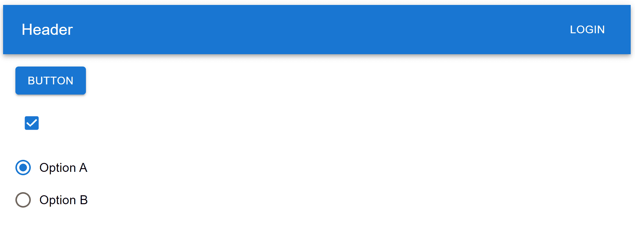
Let’s assume we have a header with some input elements on the screen and want to change the button’s primary color.
import {
  Button,
  Box,
  AppBar,
  Toolbar,
  Typography,
  Checkbox,
  FormControl,
  FormControlLabel,
  RadioGroup,
  Radio,
  Stack
} from "@mui/material";

export default function App() {
  return (
    <Box>
      <Box sx={{ flexGrow: 1 }}>
        <AppBar position="static">
          <Toolbar>
            <Typography variant="h6" component="div" sx={{ flexGrow: 1 }}>
              Header
            </Typography>
            <Button color="inherit">Login</Button>
          </Toolbar>
        </AppBar>
      </Box>
      <Stack gap={2} sx={{ p: 2 }} alignItems="flex-start">
        <Button variant="contained">
          Button
        </Button>
        <Box>
          <Checkbox defaultChecked />
        </Box>
        <Stack direction="row">
          <FormControl>
            <RadioGroup
              aria-labelledby="demo-radio-buttons-group-label"
              defaultValue="optionA"
              name="radio-buttons-group"
            >
              <FormControlLabel
                value="optionA"
                control={<Radio />}
                label="Option A"
              />
              <FormControlLabel
                value="optionB"
                control={<Radio />}
                label="Option B"
              />
            </RadioGroup>
          </FormControl>
        </Stack>
      </Stack>
    </Box>
  );
}
Adding a new background color using sx can be persuasively an easy and quick solution:
<Button sx={{ bgcolor: "#2a9461" }}>
  Button
</Button>
But the problem arises when the primary color is used in other elements. Remember that we aren’t just changing the background color, we are also changing the primary palette color. So with the above solution, we need to apply the exact change to all other elements, such as the checkbox, radio buttons, and headers.
Below, we can see how the change only affected the button but not the rest.
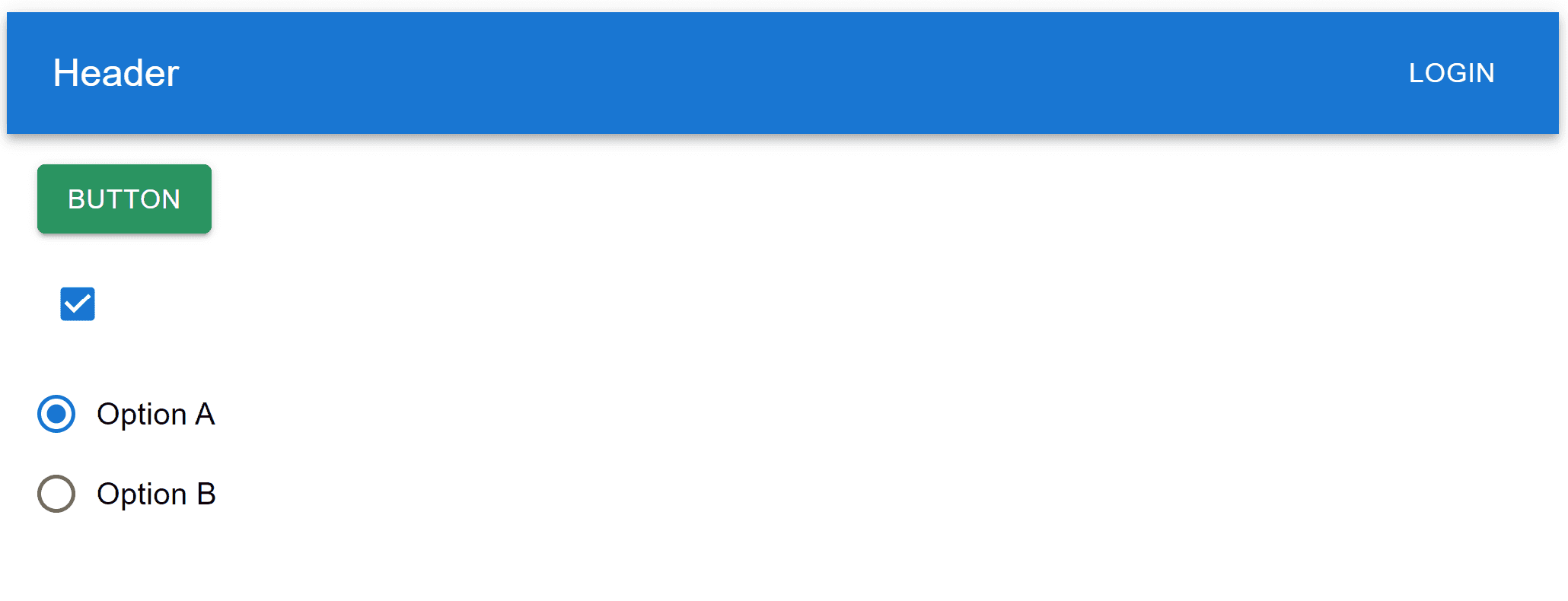
This approach is redundant and hard to scale as the application grows bigger and bigger. For that reason, MUI provides a ThemeProvider component to inject a theme into our application.
How to use it
Let’s create a new custom theme in the main app component to override the primary color and then pass it into ThemeProvider.
import { ThemeProvider, createTheme } from "@mui/material/styles";

const theme = createTheme({
  palette: {
    primary: {
      main: "#2a9461"
    }
  }
});

export default function App() {
  return (
    <ThemeProvider theme={theme}>
      // MUI components
    </ThemeProvider>
  );
}
Here is how it looks after creating a custom theme:

Similarly, we can customize other palettes like the secondary color.
import { ThemeProvider, createTheme } from "@mui/material/styles";

const theme = createTheme({
  palette: {
    primary: {
      main: "#2a9461"
    },
    secondary: {
      main: "#494c7d"
    }
  }
});

export default function App() {
  return (
    <ThemeProvider theme={theme}>
      // MUI components
    </ThemeProvider>
  );
}
We have to set the color value to use a secondary color. If not specified, the default is primary.
Let’s change the header and button to a secondary color.
export default function App() {
  return (
    <Box>
      <Box sx={{ flexGrow: 1 }}>
        <AppBar position="static" color="secondary">
          <Toolbar>
            <Typography variant="h6" component="div" sx={{ flexGrow: 1 }}>
              Header
            </Typography>
            <Button color="inherit">Login</Button>
          </Toolbar>
        </AppBar>
      </Box>
      <Stack gap={2} sx={{ p: 2 }} alignItems="flex-start">
        <Button variant="contained" color="secondary">
          Button
        </Button>
        <Box>
          <Checkbox defaultChecked />
        </Box>
        <Stack direction="row">
          <FormControl>
            <RadioGroup
              aria-labelledby="demo-radio-buttons-group-label"
              defaultValue="optionA"
              name="radio-buttons-group"
            >
              <FormControlLabel
                value="optionA"
                control={<Radio />}
                label="Option A"
              />
              <FormControlLabel
                value="optionB"
                control={<Radioo />}
                label="Option B"
              />
            </RadioGroup>
          </FormControl>
        </Stack>
      </Stack>
    </Box>
  );
}
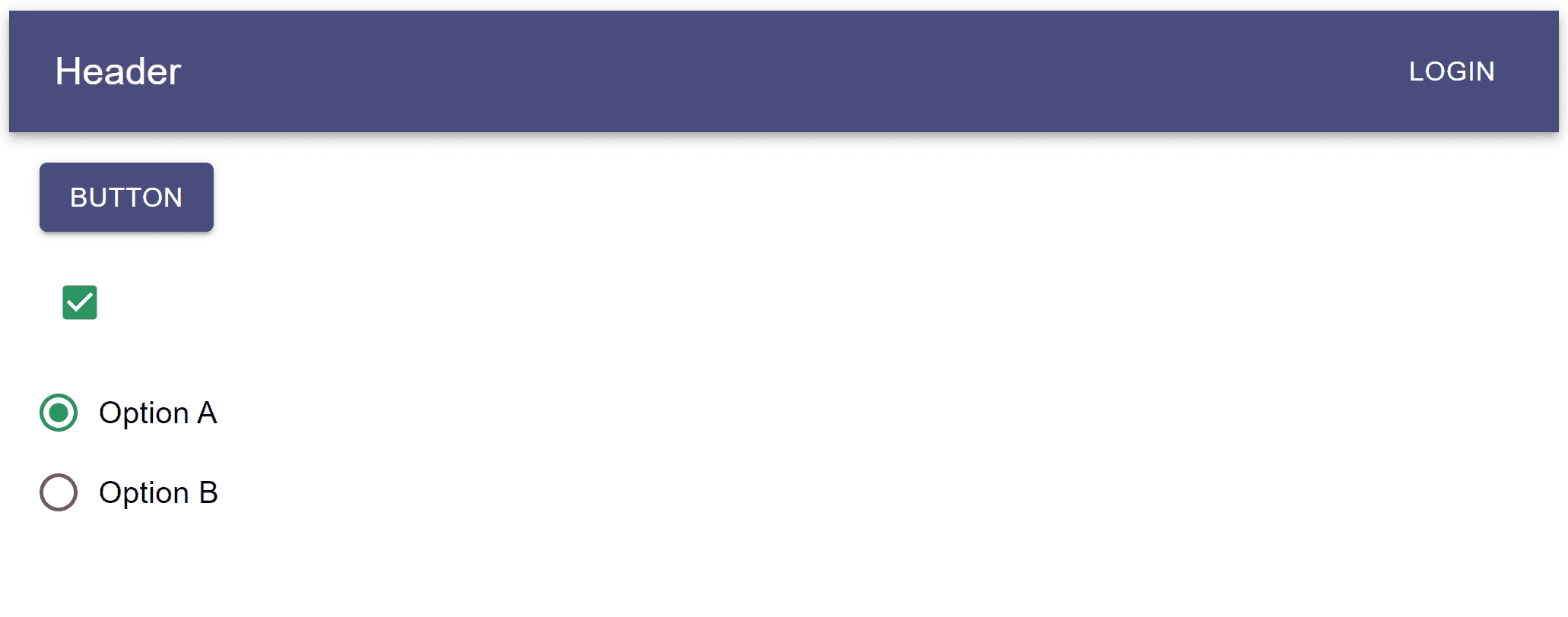
We can see how “primary” and “secondary” now reflects the new colors (green and purple).
Custom palette
How it works
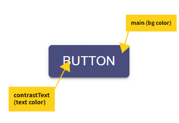
The default theme has several built-in palettes, such as primary, secondary, success, and warning.
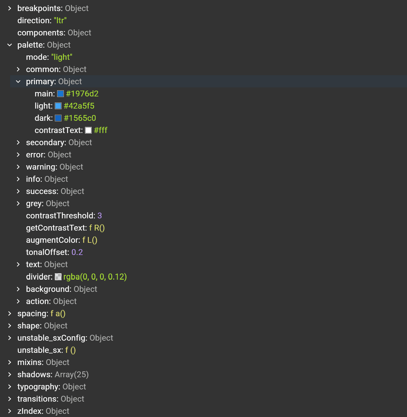
And as shown above, each palette has four values (main, dark, light and contrastText).
When styling components using sx, we can directly access values as follows:
<Button sx={{ color: "primary.main" }}>Button</Button>Which is a shortcut to doing this:
<Button sx={{ color: (theme) => theme.palette.primary.main }}>
  Button
</Button>
Cool right! Now, when using the color prop to set a palette, MUI will automatically pick “main” as the main color and “contrastText” as the text color.
<Button variant="contained" color="secondary">
  Button
</Button>
Create a new palette
We can append a new color to the palette object with a main and text color to create a new custom palette.
const theme = createTheme({
  palette: {
    primary: {
      main: "#2a9461"
    },
    secondary: {
      main: "#494c7d"
    },
    primaryLight: {
      main: "#dbece2",
      contrastText: "#616161"
    }
  }
});
“contrastText”, “dark” and “light” are optional, and if omitted, their values will be calculated automatically according to the “tonalOffset” and “contrastThreshold” of the “main” value. More details on this are available on MUI Palette Documentation
Let’s replace the header color with the new custom palette we just created.
export default function App() {
  return (
    <Box>
      <Box sx={{ flexGrow: 1 }}>
        <AppBar position="static" color="primaryLight">
          <Toolbar>
            <Typography variant="h6" component="div" sx={{ flexGrow: 1 }}>
              Header
            </Typography>
            <Button color="inherit">Login</Button>
          </Toolbar>
        </AppBar>
      </Box>
      <Stack gap={2} sx={{ p: 2 }} alignItems="flex-start">
        <Button variant="contained" color="secondary">
          Button
        </Button>
        <Box>
          <Checkbox defaultChecked />
        </Box>
        <Stack direction="row">
          <FormControl>
            <RadioGroup
              aria-labelledby="demo-radio-buttons-group-label"
              defaultValue="optionA"
              name="radio-buttons-group"
            >
              <FormControlLabel
                value="optionA"
                control={<Radio />}
                label="Option A"
              />
              <FormControlLabel
                value="optionB"
                control={<Radioo />}
                label="Option B"
              />
            </RadioGroup>
          </FormControl>
        </Stack>
      </Stack>
    </Box>
  );
}
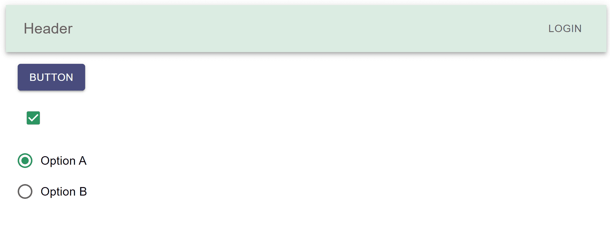
We can see above how the header reflects the new text and background color.
One last detail, if we’re using typescript, we also need to use module augmentation for the theme to accept the new values.
declare module '@mui/material/styles' {
  interface Palette {
    primaryLight: Palette['primary'];
  }

  interface PaletteOptions {
    primaryLight: PaletteOptions['primary'];
  }
}
Custom colors
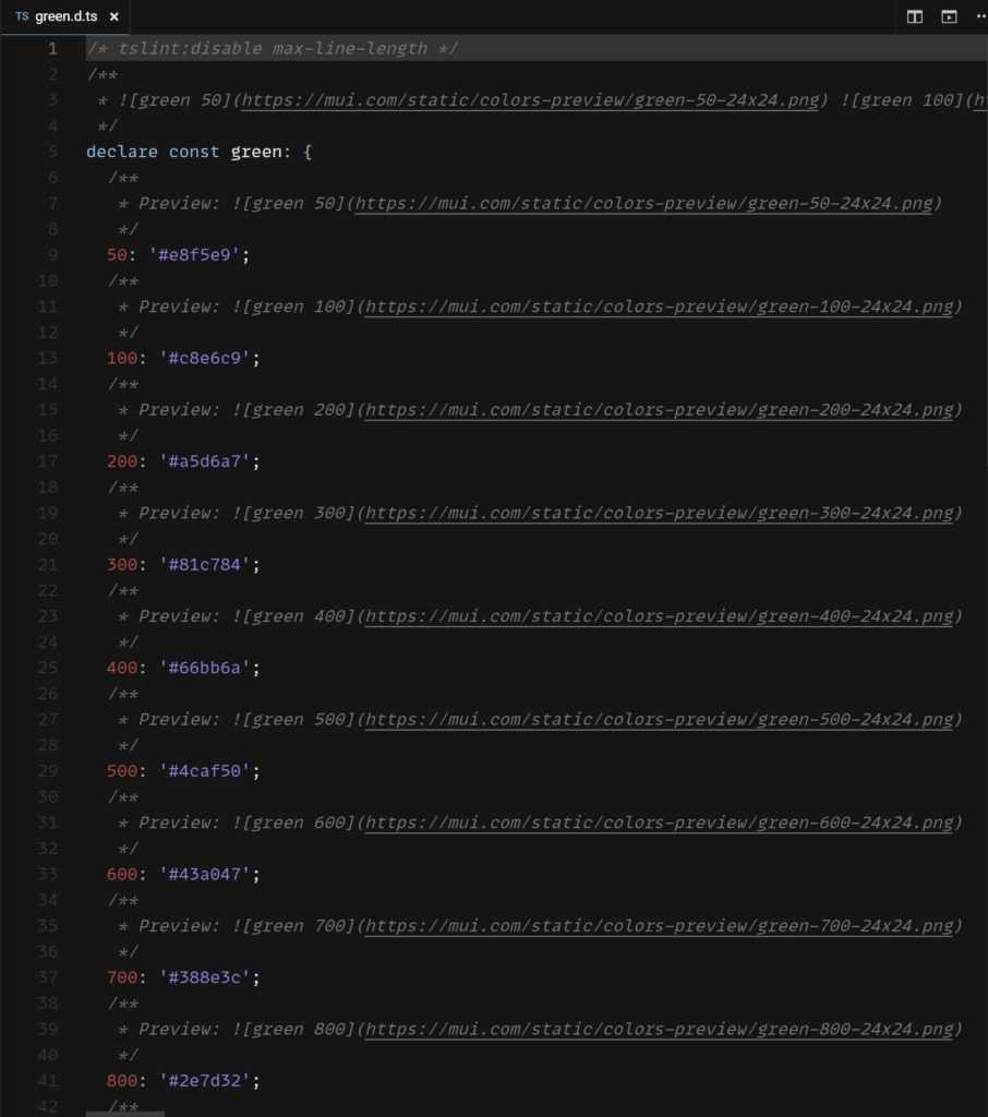
MUI theme provides a set of built-in colors that we can import and use anywhere in the application. Each set of colors comes with all shades from 0 to 100.
Let’s import the theme colors and replace the values we had earlier.
import { createTheme } from '@mui/material/styles';
import { green, purple } from '@mui/material/colors';

const theme = createTheme({
  palette: {
    primary: {
      main: green[500],
    },
    secondary: {
      main: purple[500],
    },
  },
});
If we look into the source code, we can see all the provided shades.
Great, but there is a caveat, not every green palette is the same. The one MUI provides won’t work with the new primary and secondary colors we created, so we need to add our own custom colors and shades.
Usually, the designer provides us with all the necessary shades. But for now, we can use this helpful tool to autogenerate it from the primary and secondary hex values we added in the first section (#2a9461 and #494c7d).
Let’s create a new color.js file that exports all the new shades we just generated:
export const green = {
  50: "#dbece2",
  100: "#a7d0b8",
  200: "#6eb18b",
  300: "#2a9461",
  400: "#008044",
  500: "#006c27",
  600: "#006020",
  700: "#005116",
  800: "#00410b",
  900: "#002700"
};

export const purple = {
  50: "#e9eaf0",
  100: "#c7cada",
  200: "#a3a8c1",
  300: "#8186a7",
  400: "#686c95",
  500: "#505485",
  600: "#494c7d",
  700: "#414371",
  800: "#393964",
  900: "#2d2a4c"
};
Now, we can import the new colors and use them in the custom theme:
import { green, purple } from "./colors";
import { ThemeProvider, createTheme } from "@mui/material/styles";

const theme = createTheme({
  palette: {
    primary: {
      main: green[300]
    },
    secondary: {
      main: purple[600]
    },
    primaryLight: {
      main: green[50]
    }
  }
});
Summary
Having a theme brings consistency and minimizes redundancies when styling components. In this article, we learned how to override MUI theme, add a new custom palette, and use custom colors and shades.
Lastly, understanding MUI’s system is essential for maximizing usability and enhancing the developer’s experience.
Bye for now 👋


