


MUI components have plenty of useful built-in styles and variants, but we might still need to customize them (behavioral or styling changes).
This tutorial will explain how to create a custom MUI button style and add a new pill-shaped variant. If you’d like to skip all the details, below is the final working code on CodeSandbox:
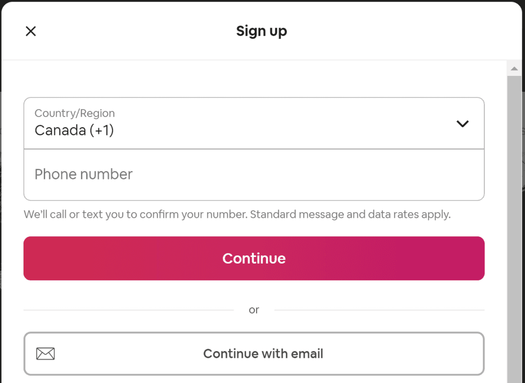
It is widespread to have round and square buttons used interchangeably within a web app. Take Airbnb as an example; the search button is round while the signup is square:

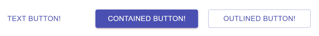
Currently, MUI Button comes with three variants (text, contained, and outlined):
The easiest way to add style overrides in MUI is to use sx prop available on all components. Here is an example:
<Button variant="contained"
  sx={{
    borderRadius: 50
  }}
>
  Button
</Button>;
The code above is perfectly valid to style a pill-shaped button. However, if we want to add more styles and eventually use them in multiple places, it’s always a good practice to encapsulate everything in a custom component.
Install MUI
npm install @mui/material @emotion/react @emotion/styledEmotion library is required to create React components with styles attached to them.
Customize button style
Let’s create a new Button component that extends the original MUI Button using styles() utility. That will allow us to customize it and inherit all existing features:
import { styled } from "@mui/material/styles";
import MuiButton from "@mui/material/Button";

export const Button = styled(MuiButton)((props) => ({
  // Custom CSS
}));
Note: we imported Material Button as MuiButton so it does not conflict with our custom Button component
To customize the style, we’ll add a pill prop and pass it down as a borderRadius value.
export const Button = styled(MuiButton)(({ pill }) => ({
borderRadius: pill ? 50 : 4
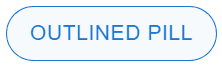
}));If the consumer does not pass the pill prop, the radius value will be the original 4px. Otherwise, it will be set to 50px. Here is how we can consume the component:
import { Button } from "./components/Button";

export default function App() {
  return (
      <div>
        <Button variant="outlined" pill>
          Outlined Pill
        </Button>
      </div>
  );
}
Update default theme
Instead of using a radius value directly, we can define it in the default MUI theme as a new property. This way, all the design tokens will be in one place and re-used in different components.
Let’s add a ThemeProvider component and insert a new token in the shape property:
import { Button } from "./components/Button";
import { createTheme, ThemeProvider } from "@mui/material/styles";

let theme = createTheme({
  shape: {
    pillRadius: 50
  }
});

export default function App() {
  return (
    <ThemeProvider theme={theme}>
      <Button variant="outlined" pill>
        Outlined Pill
      </Button>
    </ThemeProvider>
  );
}
Now, in the Button component, we can use the new radius token as follows:
import { styled } from "@mui/material/styles";
import MuiButton from "@mui/material/Button";

export const Button = styled(MuiButton)(({ theme, pill }) => ({
  borderRadius: pill ? theme.shape.pillRadius : theme.shape.borderRadius
}));
The shape object already had a default borderRadius token that we can also use.
Final Thoughts
Although the solution requires more work than just adding styles directly, it will create better encapsulation, scalability, and re-usability across the project.
Bye for now 👋


