


Applying spacing between components is an essential part of building a UI. One common way is to use CSS padding and margin. MUI spacing provides an efficient way to apply inline padding and margin in components and a theme helper function that allows us to systemize spacing throughout the application.
This tutorial will explore the MUI’s approach to creating spacing and customizing it to fit our design system.
Inline Padding and Margin
MUI sx prop allows us to apply padding and margin to our components with shorthand properties.
For example, when using the normal padding syntax, we would write:
<Box sx={{ paddingRight: "16px" }} />But with the shorthand syntax, we can write:
<Box sx={{ pr: "16px" }} />This has the benefit of being shorter and allows us to use the spacing scale defined in the theme. Later in this tutorial, we will explore how to customize the spacing scale.
Here is a list of the available margin and padding properties with the actions they perform:
Padding Properties
| Property | Description | Action |
|---|---|---|
p |
Padding | Applies padding to all sides |
px |
Padding X | Applies padding to the left and right sides |
py |
Padding Y | Applies padding to the top and bottom sides |
pt |
Padding Top | Applies padding to the top side |
pr |
Padding Right | Applies padding to the right side |
pb |
Padding Bottom | Applies padding to the bottom side |
pl |
Padding Left | Applies padding to the left side |
Margin Properties
| Property | Description | Action |
|---|---|---|
m |
Margin | Applies margin to all sides |
mx |
Margin X | Applies margin to the left and right sides |
my |
Margin Y | Applies margin to the top and bottom sides |
mt |
Margin Top | Applies margin to the top side |
mr |
Margin Right | Applies margin to the right side |
mb |
Margin Bottom | Applies margin to the bottom side |
ml |
Margin Left | Applies margin to the left side |
In the following example, we will add padding to the Box component using the p property and margin to the Typography component using the mx property to center the text content.
import React from "react"
import { Box, Typography } from "@mui/material"
export default function App() {
  return (
    <Box
      sx={{
        p: "16px",
        backgroundColor: "#c9e4d5",
        color: "#fff",
      }}
    >
      <Typography
        sx={{
          backgroundColor: "#6669ad",
          width: "fit-content",
          p: "16px",
          mx: "auto",
        }}
      >
        Hello World
      </Typography>
    </Box>
  )
}
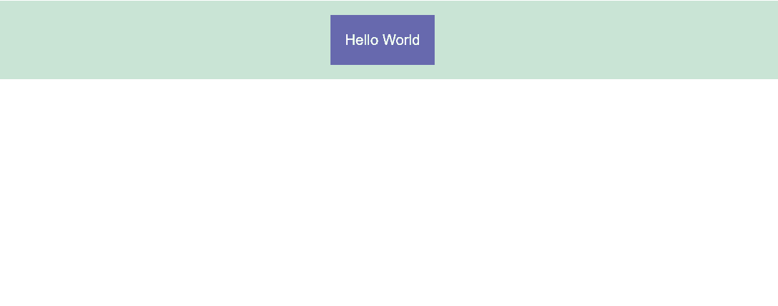
The results above demonstrate how p applies padding to all sides and mx applies margin to the left and right sides of the Typography component.
Theme Spacing
MUI provides a theme helper function to systemize spacing and create consistency all throughout the application. The theme.spacing function returns a value from the spacing scale based on the argument passed to it.
Default Spacing Scale
By default, MUI uses the 8px scaling factor. So, when we pass 1 to the theme.spacing function, it will return 8px. Similarly, when we pass 2, it will return 16px and so on.
Let’s try a simple example to understand how it works. We will create a Box component and apply padding to it using the theme.spacing function.
<Box
  sx={{
    p: theme => theme.spacing(2),
  }}
>
  Hello World
</Box>
The padding value is now 16px, which is the value returned by the theme.spacing function when we pass 2 to it.
To simplify this, we can pass only the number to the p property, and MUI will automatically call the theme.spacing function for us!
<Box
  sx={{
    p: 2, // equivalent to (theme) => theme.spacing(2)
  }}
>
  Hello World
</Box>
Custom Spacing Scale
We can use the spacing property in the theme object to customize the spacing scale and pass it a new value.
import React from "react"
import { createTheme, ThemeProvider, Box } from "@mui/material"

const theme = createTheme({
  spacing: 4,
})

export default function App() {
  return (
    <ThemeProvider theme={theme}>
      <Box
        sx={{
          p: 2, // 8px
        }}
      >
        ...
      </Box>
    </ThemeProvider>
  )
}
Now, the padding value is 8px because we have changed the spacing scale to a multiple of 4.
Alternatively, we can pass an array of values to the spacing property to create a custom spacing scale.
import React from "react"
import { createTheme, ThemeProvider, Box } from "@mui/material"

const theme = createTheme({
  spacing: ["0", "4px", "8px", "16px", "32px", "64px"],
})

export default function App() {
  return (
    <ThemeProvider theme={theme}>
      <Box
        sx={{
          p: 2, // 8px
        }}
      >
        ...
      </Box>
    </ThemeProvider>
  )
}
When using a custom array, the value passed to the theme.spacing function will be used as an index to return the value from the array. So, when we pass 2, it will return 8px because it is the value at index 2 in the array.
Grid and Flex Gap
Creating spacing is not limited to padding and margin. CSS grid and flex have a gap property for creating spacing between components in a grid or flex layout. Additionally, the value of the gap property is used by the theme.spacing function to utilize the spacing scale.
In the following example, we will create a grid layout with 3 columns using the Grid component. We will use the gap property to create spacing between the grid items.
import React from "react"
import { createTheme, ThemeProvider, Grid, Box } from "@mui/material"

const theme = createTheme({
  spacing: 4,
})

export default function App() {
  return (
    <ThemeProvider theme={theme}>
      <Grid container gap={2} wrap="nowrap">
        <Grid item xs={4}>
          <Box
            sx={{
              backgroundColor: "#c9e4d5",
              height: "100px",
            }}
          />
        </Grid>
        <Grid item xs={4}>
          <Box
            sx={{
              backgroundColor: "#c9e4d5",
              height: "100px",
            }}
          />
        </Grid>
        <Grid item xs={4}>
          <Box
            sx={{
              backgroundColor: "#c9e4d5",
              height: "100px",
            }}
          />
        </Grid>
      </Grid>
    </ThemeProvider>
  )
}

Similar to the margin and padding, gap={2} is equivalent to gap={theme => theme.spacing(2)} and will return 8px because we have set the spacing scale to a multiple of 4.
gap can also be used in sx prop to create spacing between flex or grid items without using the Grid component.
<Box
  sx={{
    display: "flex",
    gap: 2,
  }}
>
  ...
</Box><Box
sx={{
display: "grid",
gap: 2,
}}
>
...
</Box>Summary
In this tutorial, we learned how spacing works in MUI using sx inline styles and a custom spacing scale in the theme. It is important to follow and create a spacing system in our application; it makes the UI look more consistent and the code easier to maintain and scale.
Bye for now 👋


