


An editable table is an essential component in many applications in the real world. While plenty of excellent React libraries are feature-rich and easy to use for editing tables, most are paid services or need to be customized to fit business requirements.
In this tutorial, we’ll go through all the steps to create a dynamic editable table using TanStack Table, a Headless UI library for building robust tables and data grids in React. Since it’s just a utility, we have complete control over the UI structure and editable elements. We will be covering some of the basics, but having some basic knowledge is recommended.
The aim is to design a flexible enough component where we can provide the data source with the columns schema, and the table can adapt accordingly.
Let’s take a simplified example; if we have the data and column input below, the editable table will populate input text fields for all cells.
const data = [
  {
    studentId: 1111,
    name: "Bahar Constantia",
    dateOfBirth: "1984-01-04",
    major: "Computer Science",
  },
  {
    studentId: 2222,
    name: "Harold Nona",
    dateOfBirth: "1961-05-10",
    major: "Communications",
  },
  {
    studentId: 3333,
    name: "Raginolf Arnulf",
    dateOfBirth: "1991-10-12",
    major: "Business",
  },
  {
    studentId: 4444,
    name: "Marvyn Wendi",
    dateOfBirth: "1978-09-24",
    major: "Psychology",
  },
]
const columns = [
{
header: "Student ID",
type: "text",
},
{
header: "Full Name",
type: "text",
},
{
header: "Date Of Birth",
type: "text",
},
{
header: "Major",
type: "text",
},
]On the other hand, if some column types change from “text” to “date” or “number”, the table will respond dynamically and populate a date or number input field instead of a text field.
const columns = [
  {
    header: "Student ID",
    type: "number",
  },
  {
    header: "Full Name",
    type: "text",
  },
  {
    header: "Date Of Birth",
    type: "date",
  },
  {
    header: "Major",
    type: "select",
  },
]
The above demo is how we want the table to look and behave at the end of the tutorial. So without further ado, let’s dive into the implementation🚀
Creating a basic table
To get started with TanStack Table, we have to create a model type, default data, and a column definition, which is essential to creating a basic table and, eventually, dynamic editable cells. Please refer to the official documentation for a more detailed understanding.
type Student = {
  studentId: number;
  name: string;
  dateOfBirth: string;
  major: string;
};

const defaultData: Student[] = [
  {
    studentId: 1111,
    name: "Bahar Constantia",
    dateOfBirth: "1984-01-04",
    major: "Computer Science",
  },
  {
    studentId: 2222,
    name: "Harold Nona",
    dateOfBirth: "1961-05-10",
    major: "Communications",
  },
  {
    studentId: 3333,
    name: "Raginolf Arnulf",
    dateOfBirth: "1991-10-12",
    major: "Business",
  },
  {
    studentId: 4444,
    name: "Marvyn Wendi",
    dateOfBirth: "1978-09-24",
    major: "Psychology",
  },
];

const columnHelper = createColumnHelper<Student>();

const columns = [
  columnHelper.accessor("studentId", {
    header: "Student ID",
  }),
  columnHelper.accessor("name", {
    header: "Full Name",
  }),
  columnHelper.accessor("dateOfBirth", {
    header: "Date Of Birth",
  }),
  columnHelper.accessor("major", {
    header: "Major",
  }),
];
columns can be a regular object, but using createColumnHelper provides a utility for creating different column definition types.
Let’s add the rest of the code to get the basic TanStack table running.
import { useState } from "react";
import "./table.css";

import {
  createColumnHelper,
  flexRender,
  getCoreRowModel,
  useReactTable,
} from "@tanstack/react-table";

type Student = {
  studentId: number;
  name: string;
  dateOfBirth: string;
  major: string;
};

const defaultData: Student[] = [
  {
    studentId: 1111,
    name: "Bahar Constantia",
    dateOfBirth: "1984-01-04",
    major: "Business",
  },
  {
    studentId: 2222,
    name: "Harold Nona",
    dateOfBirth: "1961-05-10",
    major: "Communications",
  },
  {
    studentId: 3333,
    name: "Raginolf Arnulf",
    dateOfBirth: "1991-10-12",
    major: "Business",
  },
  {
    studentId: 4444,
    name: "Marvyn Wendi",
    dateOfBirth: "1978-09-24",
    major: "Business",
  },
];

const columnHelper = createColumnHelper<Student>();

const columns = [
  columnHelper.accessor("studentId", {
    header: "Student ID",
  }),
  columnHelper.accessor("name", {
    header: "Full Name",
  }),
  columnHelper.accessor("dateOfBirth", {
    header: "Date Of Birth",
  }),
  columnHelper.accessor("major", {
    header: "Major",
  }),
];

export const Table = () => {
  const [data, setData] = useState(() => [...defaultData]);

  const table = useReactTable({
    data,
    columns,
    getCoreRowModel: getCoreRowModel(),
  });

  return (
    <table>
      <thead>
        {table.getHeaderGroups().map((headerGroup) => (
          <tr key={headerGroup.id}>
            {headerGroup.headers.map((header) => (
              <th key={header.id}>
                {header.isPlaceholder
                  ? null
                  : flexRender(
                      header.column.columnDef.header,
                      header.getContext()
                    )}
              </th>
            ))}
          </tr>
        ))}
      </thead>
      <tbody>
        {table.getRowModel().rows.map((row) => (
          <tr key={row.id}>
            {row.getVisibleCells().map((cell) => (
              <td key={cell.id}>
                {flexRender(cell.column.columnDef.cell, cell.getContext())}
              </td>
            ))}
          </tr>
        ))}
      </tbody>
    </table>
  );
};
In addition, we added some styling to the table - margins, alignments, and borders.
table {
  font-family: sans-serif;
  border-collapse: collapse;
  border: 1px solid #ccc;
  margin: 25px;
  background-color: #fff;
}
tr {
  border-bottom: 1px solid #ccc;
}
th,
td {
  text-align: left;
  padding: 8px 10px;
}
Adding editable cells
We’ll start with the most straightforward approach by replacing cells with input text fields, and we’ll make sure to structure the code in a way that will scale as we progress to the other sections.
Let’s create a new Table Cell component with a state and an input field.
const TableCell = () => {
  const [value, setValue] = useState("")

  return <input value={value} onChange={e => setValue(e.target.value)} />
}
The column definition provides a cell prop to render any element we need instead of the default text value. This way, we can add the new TableCell component in all columns.
const columns = [
  columnHelper.accessor("studentId", {
    header: "Student ID",
    cell: TableCell,
  }),
  columnHelper.accessor("name", {
    header: "Full Name",
    cell: TableCell,
  }),
  columnHelper.accessor("dateOfBirth", {
    header: "Date Of Birth",
    cell: TableCell,
  }),
  columnHelper.accessor("major", {
    header: "Major",
    cell: TableCell,
  }),
]
When the cell prop renders the component, it will provide all the information we need to access the table and update the value. But before going there, we need to create a new function in the main Table component to update the data based on the modified row and column.
The function will have three parameters - row index, column id, and value.
export const Table = () => {
  const [data, setData] = useState(() => [...defaultData]);

  const table = useReactTable({
    data,
    columns,
    getCoreRowModel: getCoreRowModel(),
    meta: {
      updateData: (rowIndex: number, columnId: string, value: string) => {
        setData((old) =>
          old.map((row, index) => {
            if (index === rowIndex) {
              return {
                ...old[rowIndex],
                [columnId]: value,
              };
            }
            return row;
          })
        );
      },
    },
  });

  return (...);
Notice that we added the function in a meta object, which is part of the useReactTable options and can be accessed anywhere the table is available via table.options.meta.
Now that we have all the functions and props we need, let’s complete the TableCell component to trigger the update function.
const TableCell = ({ getValue, row, column, table }) => {
  const initialValue = getValue()
  const [value, setValue] = useState(initialValue)

  useEffect(() => {
    setValue(initialValue)
  }, [initialValue])

  const onBlur = () => {
    table.options.meta?.updateData(row.index, column.id, value)
  }

  return (
    <input
      value={value}
      onChange={e => setValue(e.target.value)}
      onBlur={onBlur}
    />
  )
}
We are using the onBlur to trigger the updateData function, and as we can see, it’s now available in table.options.meta. In addition, we’re passing a default value to the input field using getValue, which is available for us from the props.
Now, let’s put everything together and look at what we have so far.
import { useState, useEffect } from "react";
import "./table.css";

import {
  createColumnHelper,
  flexRender,
  getCoreRowModel,
  useReactTable,
} from "@tanstack/react-table";

type Student = {
  studentId: number;
  name: string;
  dateOfBirth: string;
  major: string;
};

const defaultData: Student[] = [
  {
    studentId: 1111,
    name: "Bahar Constantia",
    dateOfBirth: "1984-01-04",
    major: "Business",
  },
  {
    studentId: 2222,
    name: "Harold Nona",
    dateOfBirth: "1961-05-10",
    major: "Communications",
  },
  {
    studentId: 3333,
    name: "Raginolf Arnulf",
    dateOfBirth: "1991-10-12",
    major: "Business",
  },
  {
    studentId: 4444,
    name: "Marvyn Wendi",
    dateOfBirth: "1978-09-24",
    major: "Business",
  },
];

const TableCell = ({ getValue, row, column, table }) => {
  const initialValue = getValue();
  const [value, setValue] = useState(initialValue);

  useEffect(() => {
    setValue(initialValue);
  }, [initialValue]);

  const onBlur = () => {
    table.options.meta?.updateData(row.index, column.id, value);
  };

  return (
    <input
      value={value}
      onChange={(e) => setValue(e.target.value)}
      onBlur={onBlur}
    />
  );
};

const columnHelper = createColumnHelper<Student>();

const columns = [
  columnHelper.accessor("studentId", {
    header: "Student ID",
    cell: TableCell,
  }),
  columnHelper.accessor("name", {
    header: "Full Name",
    cell: TableCell,
  }),
  columnHelper.accessor("dateOfBirth", {
    header: "Date Of Birth",
    cell: TableCell,
  }),
  columnHelper.accessor("major", {
    header: "Major",
    cell: TableCell,
  }),
];

export const Table = () => {
  const [data, setData] = useState(() => [...defaultData]);

  const table = useReactTable({
    data,
    columns,
    getCoreRowModel: getCoreRowModel(),
    meta: {
      updateData: (rowIndex: number, columnId: string, value: string) => {
        setData((old) =>
          old.map((row, index) => {
            if (index === rowIndex) {
              return {
                ...old[rowIndex],
                [columnId]: value,
              };
            }
            return row;
          })
        );
      },
    },
  });

  return (
    <>
      <table>
        <thead>
          {table.getHeaderGroups().map((headerGroup) => (
            <tr key={headerGroup.id}>
              {headerGroup.headers.map((header) => (
                <th key={header.id}>
                  {header.isPlaceholder
                    ? null
                    : flexRender(
                        header.column.columnDef.header,
                        header.getContext()
                      )}
                </th>
              ))}
            </tr>
          ))}
        </thead>
        <tbody>
          {table.getRowModel().rows.map((row) => (
            <tr key={row.id}>
              {row.getVisibleCells().map((cell) => (
                <td key={cell.id}>
                  {flexRender(cell.column.columnDef.cell, cell.getContext())}
                </td>
              ))}
            </tr>
          ))}
        </tbody>
      </table>
      <pre>{JSON.stringify(data, null, "\t")}</pre>
    </>
  );
};
The object is printed out at the end to validate that the input updates are working as expected.
Supporting dynamic types
So far, we’ve created an editable table that only supports text fields. As mentioned in the introduction, the goal is to be able to define different column types and render the appropriate elements dynamically.
Let’s start by adding a new type prop to the columns object.
const columns = [
  columnHelper.accessor("studentId", {
    header: "Student ID",
    cell: TableCell,
    meta: {
      type: "number",
    },
  }),
  columnHelper.accessor("name", {
    header: "Full Name",
    cell: TableCell,
    meta: {
      type: "text",
    },
  }),
  columnHelper.accessor("dateOfBirth", {
    header: "Date Of Birth",
    cell: TableCell,
    meta: {
      type: "date",
    },
  }),
  columnHelper.accessor("major", {
    header: "Major",
    cell: TableCell,
    meta: {
      type: "text",
    },
  }),
]
Similar to the table, the columns provide a meta object to add whatever we’d like to it. All we need to do is get the type from the meta object and pass it to the input field in the TableCell component.
const TableCell = ({ getValue, row, column, table }) => {
  const initialValue = getValue()
  const [value, setValue] = useState(initialValue)

  useEffect(() => {
    setValue(initialValue)
  }, [initialValue])

  const onBlur = () => {
    table.options.meta?.updateData(row.index, column.id, value)
  }

  return (
    <input
      value={value}
      onChange={e => setValue(e.target.value)}
      onBlur={onBlur}
      type={column.columnDef.meta?.type || "text"}
    />
  )
}
Voila! That was fast!
What if we want a more complex data type, like a select element? Well, for that, we need to do a bit more work 🙂
Here are the steps we need to follow:
- Change the “Major” col type to “select” and provide all the select options within the column
meta. Remember, we want to make this as dynamic as possible to support different data models. - Introduce a new
selectelement in theTableCellcomponent, which will populate all options from the columnmetaobject.
type Option = {
  label: string;
  value: string;
};

const TableCell = ({ getValue, row, column, table }) => {
  const initialValue = getValue();
  const columnMeta = column.columnDef.meta;
  const tableMeta = table.options.meta;
  const [value, setValue] = useState(initialValue);

  useEffect(() => {
    setValue(initialValue);
  }, [initialValue]);

  const onBlur = () => {
    tableMeta?.updateData(row.index, column.id, value);
  };

  const onSelectChange = (e: ChangeEvent<HTMLSelectElement>) => {
    setValue(e.target.value);
    tableMeta?.updateData(row.index, column.id, e.target.value);
  };

  return columnMeta?.type === "select" ? (
    <select onChange={onSelectChange} value={initialValue}>
      {columnMeta?.options?.map((option: Option) => (
        <option key={option.value} value={option.value}>{option.label}</option>
      ))}
    </select>
  ) : (
    <input
      value={value}
      onChange={(e) => setValue(e.target.value)}
      onBlur={onBlur}
      type={columnMeta?.type || "text"}
    />
  );
};

const columnHelper = createColumnHelper<Student>();

const columns = [
  columnHelper.accessor("studentId", {
    header: "Student ID",
    cell: TableCell,
    meta: {
      type: "number",
    },
  }),
  columnHelper.accessor("name", {
    header: "Full Name",
    cell: TableCell,
    meta: {
      type: "text",
    },
  }),
  columnHelper.accessor("dateOfBirth", {
    header: "Date Of Birth",
    cell: TableCell,
    meta: {
      type: "date",
    },
  }),
  columnHelper.accessor("major", {
    header: "Major",
    cell: TableCell,
    meta: {
      type: "select",
      options: [
        { value: "Computer Science", label: "Computer Science" },
        { value: "Communications", label: "Communications" },
        { value: "Business", label: "Business" },
        { value: "Psychology", label: "Psychology" },
      ],
    },
  }),
];
As we can see in the code and demo above, the “number”, “date” and “select” along with the options, are all correctly showing. For the select element, we defined a new onSelectChange event to trigger the update function. Additionally, we did some code cleanup to make accessing column and table less verbose.
Editable rows
We often want the table to be read-only and switch to an edit mode on demand. The reasons could be performance enhancement or want to submit data to the server, so avoid triggering an API call on every field.
A common practice is to add an action button in a new column that will toggle the row between edit and non-edit mode. It will also contain a cancel action in case the user wants to abort changes.
Let’s start with creating an editedRows state, a key/value object that indicates which rows are in edit mode. We’ll also add the getter and setter to the table meta so we can access it from other components.
export const Table = () => {
  const [data, setData] = useState(() => [...defaultData]);
  const [editedRows, setEditedRows] = useState({});

  const table = useReactTable({
    data,
    columns,
    getCoreRowModel: getCoreRowModel(),
    meta: {
      editedRows,
      setEditedRows,
      ...
    },
  });

  return (...);
};
Then, we can create an EditCell component with “edit”, “cancel”, and “done” buttons. “cancel” and “done” will only show if the editedRows contains the row id set to true. A unique row id is automatically generated for each row through the getCoreRowModel function.
const EditCell = ({ row, table }) => {
  const meta = table.options.meta

  const setEditedRows = (e: MouseEvent<HTMLButtonElement>) => {
    meta?.setEditedRows((old: []) => ({
      ...old,
      [row.id]: !old[row.id],
    }))
  }

  return meta?.editedRows[row.id] ? (
    <>
      <button>X</button> <button onClick={setEditedRows}>✔</button>
    </>
  ) : (
    <button onClick={setEditedRows}>✐</button>
  )
}
We also defined an event, a simple true/false toggle for the current row id using the setter function we just passed in the meta options.
Now, the component has to be placed in a new column. TanStack Table provides a display column option, which means it won’t be part of the data model as its only purpose is to manage the editable state.
const columns = [
  columnHelper.accessor("studentId", {
    header: "Student ID",
    cell: TableCell,
    meta: {
      type: "number",
    },
  }),
  columnHelper.accessor("name", {
    header: "Full Name",
    cell: TableCell,
    meta: {
      type: "text",
    },
  }),
  columnHelper.accessor("dateOfBirth", {
    header: "Date Of Birth",
    cell: TableCell,
    meta: {
      type: "date",
    },
  }),
  columnHelper.accessor("major", {
    header: "Major",
    cell: TableCell,
    meta: {
      type: "select",
      options: [
        { value: "Computer Science", label: "Computer Science" },
        { value: "Communications", label: "Communications" },
        { value: "Business", label: "Business" },
        { value: "Psychology", label: "Psychology" },
      ],
    },
  }),
  columnHelper.display({
    id: "edit",
    cell: EditCell,
  }),
]
Given what we have so far, the TableCell component can easily toggle between edit and non-edit modes by checking the editedRows in the table meta object.
const TableCell = ({ getValue, row, column, table }) => {
  const initialValue = getValue()
  const columnMeta = column.columnDef.meta
  const tableMeta = table.options.meta
  const [value, setValue] = useState(initialValue)

  useEffect(() => {
    setValue(initialValue)
  }, [initialValue])

  const onBlur = () => {
    tableMeta?.updateData(row.index, column.id, value)
  }

  const onSelectChange = (e: ChangeEvent<HTMLSelectElement>) => {
    setValue(e.target.value)
    tableMeta?.updateData(row.index, column.id, e.target.value)
  }

  if (tableMeta?.editedRows[row.id]) {
    return columnMeta?.type === "select" ? (
      <select onChange={onSelectChange} value={initialValue}>
        {columnMeta?.options?.map((option: Option) => (
          <option key={option.value} value={option.value}>
            {option.label}
          </option>
        ))}
      </select>
    ) : (
      <input
        value={value}
        onChange={e => setValue(e.target.value)}
        onBlur={onBlur}
        type={columnMeta?.type || "text"}
      />
    )
  }
  return <span>{value}</span>
}
Last but not least, implementing a cancel action. While there are multiple ways to achieve that, depending on the business rules and the data flow, we’ll go with a simple approach for this tutorial.
Let’s create an originalData, a copy of the data array. If the user chooses to save the row, it will update the originalData with the newly updated row. Otherwise, it will revert to the original row.
In the Edtiable Table component, we can add a new state with a revert function.
export const Table = () => {
  const [data, setData] = useState(() => [...defaultData]);
  const [originalData, setOriginalData] = useState(() => [...defaultData]);
  const [editedRows, setEditedRows] = useState({});

  const table = useReactTable({
    data,
    columns,
    getCoreRowModel: getCoreRowModel(),
    meta: {
      editedRows,
      setEditedRows,
      revertData: (rowIndex: number, revert: boolean) => {
        if (revert) {
          setData((old) =>
            old.map((row, index) =>
              index === rowIndex ? originalData[rowIndex] : row
            )
          );
        } else {
          setOriginalData((old) =>
            old.map((row, index) => (index === rowIndex ? data[rowIndex] : row))
          );
        }
      },
      updateData: ...
  });

  return (...);
};
And in the EditCell component, we can call the function when the “cancel” or “done” buttons are triggered.
const EditCell = ({ row, table }) => {
  const meta = table.options.meta

  const setEditedRows = (e: MouseEvent<HTMLButtonElement>) => {
    const elName = e.currentTarget.name
    meta?.setEditedRows((old: []) => ({
      ...old,
      [row.id]: !old[row.id],
    }))
    if (elName !== "edit") {
      meta?.revertData(row.index, e.currentTarget.name === "cancel")
    }
  }

  return meta?.editedRows[row.id] ? (
    <>
      <button onClick={setEditedRows} name="cancel">
        X
      </button>{" "}
      <button onClick={setEditedRows} name="done">
        ✔
      </button>
    </>
  ) : (
    <button onClick={setEditedRows} name="edit">
      ✐
    </button>
  )
}
Here is the code and demo of what we have so far.
import { useState, useEffect, ChangeEvent, MouseEvent } from "react";
import "./table.css";

import {
  createColumnHelper,
  flexRender,
  getCoreRowModel,
  useReactTable,
} from "@tanstack/react-table";

type Student = {
  studentId: number;
  name: string;
  dateOfBirth: string;
  major: string;
};

type Option = {
  label: string;
  value: string;
};

const defaultData: Student[] = [
  {
    studentId: 1111,
    name: "Bahar Constantia",
    dateOfBirth: "1984-01-04",
    major: "Computer Science",
  },
  {
    studentId: 2222,
    name: "Harold Nona",
    dateOfBirth: "1961-05-10",
    major: "Communications",
  },
  {
    studentId: 3333,
    name: "Raginolf Arnulf",
    dateOfBirth: "1991-10-12",
    major: "Business",
  },
  {
    studentId: 4444,
    name: "Marvyn Wendi",
    dateOfBirth: "1978-09-24",
    major: "Psychology",
  },
];

const TableCell = ({ getValue, row, column, table }) => {
  const initialValue = getValue();
  const columnMeta = column.columnDef.meta;
  const tableMeta = table.options.meta;
  const [value, setValue] = useState(initialValue);

  useEffect(() => {
    setValue(initialValue);
  }, [initialValue]);

  const onBlur = () => {
    tableMeta?.updateData(row.index, column.id, value);
  };

  const onSelectChange = (e: ChangeEvent<HTMLSelectElement>) => {
    setValue(e.target.value);
    tableMeta?.updateData(row.index, column.id, e.target.value);
  };

  if (tableMeta?.editedRows[row.id]) {
    return columnMeta?.type === "select" ? (
      <select onChange={onSelectChange} value={initialValue}>
        {columnMeta?.options?.map((option: Option) => (
          <option key={option.value} value={option.value}>{option.label}</option>
        ))}
      </select>
    ) : (
      <input
        value={value}
        onChange={(e) => setValue(e.target.value)}
        onBlur={onBlur}
        type={columnMeta?.type || "text"}
      />
    );
  }
  return <span>{value}</span>;
};

const EditCell = ({ row, table }) => {
  const meta = table.options.meta;

  const setEditedRows = (e: MouseEvent<HTMLButtonElement>) => {
    const elName = e.currentTarget.name;
    meta?.setEditedRows((old: []) => ({
      ...old,
      [row.id]: !old[row.id],
    }));
    if (elName !== "edit") {
      meta?.revertData(row.index, e.currentTarget.name === "cancel");
    }
  };

  return (
    <div className="edit-cell-container">
      {meta?.editedRows[row.id] ? (
        <div className="edit-cell">
          <button onClick={setEditedRows} name="cancel">
            X
          </button>
          <button onClick={setEditedRows} name="done">
            ✔
          </button>
        </div>
      ) : (
        <button onClick={setEditedRows} name="edit">
          ✐
        </button>
      )}
    </div>
  );
};

const columnHelper = createColumnHelper<Student>();

const columns = [
  columnHelper.accessor("studentId", {
    header: "Student ID",
    cell: TableCell,
    meta: {
      type: "number",
    },
  }),
  columnHelper.accessor("name", {
    header: "Full Name",
    cell: TableCell,
    meta: {
      type: "text",
    },
  }),
  columnHelper.accessor("dateOfBirth", {
    header: "Date Of Birth",
    cell: TableCell,
    meta: {
      type: "date",
    },
  }),
  columnHelper.accessor("major", {
    header: "Major",
    cell: TableCell,
    meta: {
      type: "select",
      options: [
        { value: "Computer Science", label: "Computer Science" },
        { value: "Communications", label: "Communications" },
        { value: "Business", label: "Business" },
        { value: "Psychology", label: "Psychology" },
      ],
    },
  }),
  columnHelper.display({
    id: "edit",
    cell: EditCell,
  }),
];

export const Table = () => {
  const [data, setData] = useState(() => [...defaultData]);
  const [originalData, setOriginalData] = useState(() => [...defaultData]);
  const [editedRows, setEditedRows] = useState({});

  const table = useReactTable({
    data,
    columns,
    getCoreRowModel: getCoreRowModel(),
    meta: {
      editedRows,
      setEditedRows,
      revertData: (rowIndex: number, revert: boolean) => {
        if (revert) {
          setData((old) =>
            old.map((row, index) =>
              index === rowIndex ? originalData[rowIndex] : row
            )
          );
        } else {
          setOriginalData((old) =>
            old.map((row, index) => (index === rowIndex ? data[rowIndex] : row))
          );
        }
      },
      updateData: (rowIndex: number, columnId: string, value: string) => {
        setData((old) =>
          old.map((row, index) => {
            if (index === rowIndex) {
              return {
                ...old[rowIndex],
                [columnId]: value,
              };
            }
            return row;
          })
        );
      },
    },
  });

  return (
    <>
      <table>
        <thead>
          {table.getHeaderGroups().map((headerGroup) => (
            <tr key={headerGroup.id}>
              {headerGroup.headers.map((header) => (
                <th key={header.id}>
                  {header.isPlaceholder
                    ? null
                    : flexRender(
                        header.column.columnDef.header,
                        header.getContext()
                      )}
                </th>
              ))}
            </tr>
          ))}
        </thead>
        <tbody>
          {table.getRowModel().rows.map((row) => (
            <tr key={row.id}>
              {row.getVisibleCells().map((cell) => (
                <td key={cell.id}>
                  {flexRender(cell.column.columnDef.cell, cell.getContext())}
                </td>
              ))}
            </tr>
          ))}
        </tbody>
      </table>
      <pre>{JSON.stringify(data, null, "\t")}</pre>
    </>
  );
};
Table styling and restructuring
Restructuring is as simple as extracting each component into its own tsx file to make the main table component smaller and leaner and eventually easier to maintain.
Here are all the components that we would like to extract into a separate file:
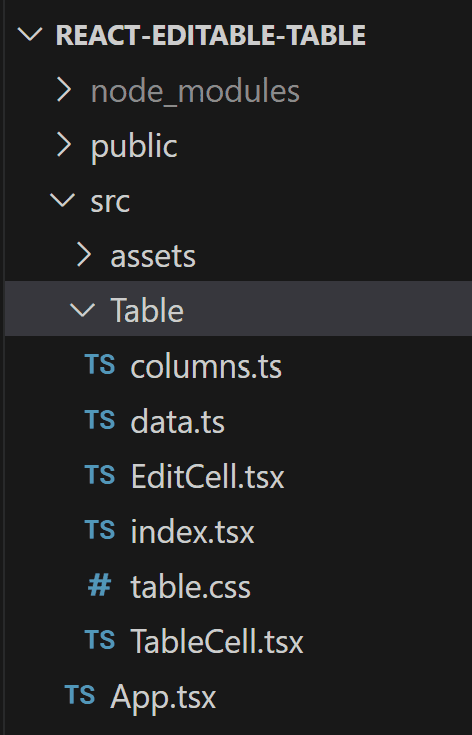
index will have the main table component that can be imported by the consumer as follows.
import { Table } from "./Table"

function App() {
  return <Table />
}

export default App
The rest are the same components we worked on in the previous sections but moved to a separate file as an isolated component and imported when required.
All files and code restructures are available in the next section.
To finish up this tutorial, let’s treat ourselves a bit and style the table with a simple yet effective CSS 🙂
table {
  border-collapse: collapse;
  margin: 25px 0;
  font-size: 14px;
  font-family: sans-serif;
  box-shadow: 0 0 20px rgba(0, 0, 0, 0.15);
  width: 720px;
}

table thead tr {
  background-color: #4bbd7f;
  color: #ffffff;
  text-align: left;
}

table th,
table td {
  padding: 10px 15px;
}

table tbody tr {
  border-bottom: 1px solid #dddddd;
}

table tbody tr:nth-of-type(even) {
  background-color: #f6f6f6;
}

table tbody tr:last-of-type {
  border-bottom: 2px solid #4bbd7f;
}

table tbody tr.active-row {
  font-weight: bold;
  color: #4bbd7f;
}

table td:first-child input {
  width: 50px;
}

table td:nth-child(2) input {
  width: 120px;
}

table .edit-cell-container button {
  border-radius: 50px;
  height: 26px;
  width: 26px;
  border: 1px solid #ccc;
  color: #ffb918;
}

table button[name="cancel"] {
  color: #7b7b7b;
}

table button[name="done"] {
  color: #4bbd7f;
}

table input,
select {
  border: 1px solid #ccc;
  border-radius: 4px;
  padding: 5px;
}

table .edit-cell {
  display: flex;
  gap: 5px;
}
Nothing out of the ordinary here, some table shadow with row colors, borders, margin, and width!
Complete code and live demo
The complete code is available in this repository. If you liked the tutorial, please star the repository, and feel free to request new features!
Alternatively, you can access the code on StackBlitz below.
Summary
In this tutorial, we learned how to utilize TanckStack to build a dynamic React editable table that supports custom column schema and row editing, saving, and canceling actions.
The solution we explored together is one of several different approaches that we can take. We also didn’t consider any performance impact. So it’s highly recommended, based on the business requirement, to conduct performance tests and asses if the code might require design pattern adjustments such as using React memo, signals, or a state management to enhance performance level.
Bye for now 👋


