In every application, specifically modern front-end apps, we tend to encapsulate styles to a specific component. This great practice helps us avoid style collisions and keep the codebase clean and maintainable. But in certain scenarios, we need to create global styles that can be applied to elements across the entire application. For example, we might need to reset the default styles of the <body> tag or create a global theme that all components can use, and so on.
In this tutorial, we will explore different techniques for creating and applying MUI global styles.
Customizing the theme
The first and most common way to create global styles in MUI is by customizing the theme. The theme is a global object containing all the application styles and configurations. All components use it and can be accessed from anywhere in the application. We’ve covered the theme in more detail in this tutorial.
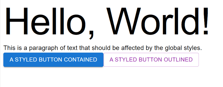
Let’s create a simple app with a few unstyled components and see the initial result.
import React from "react";
import { Typography, Button, Box } from "@mui/material";

function App() {
  return (
    <Box>
      <Typography variant="h1">Hello, World!</Typography>
      <Typography variant="p">
        This is a paragraph of text that should be affected by the global
        styles.
      </Typography>
      <Button variant="contained" color="primary">
        A Styled Button Contained
      </Button>
      <Button variant="outlined" color="secondary">
        A Styled Button Outlined
      </Button>
      {/* Other components go here */}
    </Box>
  );
}

export default App
In the following example, we’ll demonstrate how to use createTheme and ThemeProvider to set global styles that affect all instances of Typography and Button components.
import React from "react";
import { createTheme, ThemeProvider, Typography, Button, Box } from "@mui/material";

// Create a theme instance with global overrides.
const theme = createTheme({
  components: {
    MuiTypography: {
      styleOverrides: {
        root: {
          fontFamily: "Comic Sans MS, sans-serif"
        },
        h1: {
          fontSize: "2.5rem",
          color: "green"
        },
        p: {
          fontSize: "1.4rem"
        }
      }
    },
    MuiButton: {
      styleOverrides: {
        root: {
          borderRadius: "8px",
          textTransform: "none",
          fontSize: "1.4rem"
        }
      }
    }
  }
});

function App() {
  return (
    <ThemeProvider theme={theme}>
      <Box>
        <Typography variant="h1">Hello, World!</Typography>
        <Typography variant="p">
          This is a paragraph of text that should be affected by the global
          styles.
        </Typography>
        <Button variant="contained" color="primary">
          A Styled Button Contained
        </Button>
        <Button variant="outlined" color="secondary">
          A Styled Button Outlined
        </Button>
        {/* Other components go here */}
      </Box>
    </ThemeProvider>
  );
}

export default App;
What we just did only works for MUI components that are rendered inside ThemeProvider. If we want to apply styles to other HTML elements such as <body> and <html>, we need to use CssBaseline component. This component is used to apply a baseline or reset styles to the document for cross-browser consistency, and it will allow us to style the <body> and <html> elements.
import React from "react";
import {
  createTheme,
  ThemeProvider,
  Typography,
  Button,
  CssBaseline,
  Box
} from "@mui/material";

// Create a theme instance with global overrides.
const theme = createTheme({
  components: {
    MuiTypography: {
      styleOverrides: {
        root: {
          fontFamily: "Comic Sans MS, sans-serif"
        },
        h1: {
          fontSize: "2.5rem",
          color: "green"
        },
        p: {
          fontSize: "1.4rem"
        }
      }
    },
    MuiButton: {
      styleOverrides: {
        root: {
          borderRadius: "8px",
          textTransform: "none",
          fontSize: "1.4rem"
        }
      }
    },
    MuiCssBaseline: {
      styleOverrides: {
        html: {
          fontSize: "62.5%"
        }
      }
    }
  }
});

function App() {
  return (
    <ThemeProvider theme={theme}>
      <CssBaseline />
      <Box>
        <Typography variant="h1">Hello, World!</Typography>
        <Typography variant="p">
          This is a paragraph of text that should be affected by the global
          styles.
        </Typography>
        <Button variant="contained" color="primary">
          A Styled Button Contained
        </Button>
        <Button variant="outlined" color="secondary">
          A Styled Button Outlined
        </Button>
        {/* Other components go here */}
      </Box>
    </ThemeProvider>
  );
}

export default App;
In the above example, we reduced the default font size of the <html> element to 62.5%, equivalent to 10px. It’s a common technique used to make the entire document’s font size relative to the browser’s default font size.
Using GlobalStyles Component
The GlobalStyles component is used for injecting global CSS into the document. This is particularly helpful when we want to style HTML elements that are not directly handled by MUI components or for creating our own custom CSS reset.
In the following example, we’ll create a new global object called globalStyles and use it to style the <body> and <html> elements.
import React from "react";
import {
  createTheme,
  ThemeProvider,
  Typography,
  Button,
  CssBaseline,
  GlobalStyles,
  Box
} from "@mui/material";

// Create a theme instance with global overrides.
const theme = createTheme({
  ...
});

const globalStyles = (
  <GlobalStyles
    styles={(theme) => ({
      html: {
        height: "100%",
        fontSize: "62.5%"
      },
      body: {
        margin: 0,
        padding: theme.spacing(2),
        backgroundColor: theme.palette.background.default,
        color: theme.palette.text.primary,
        fontFamily: theme.typography.fontFamily
      }
      // ... You can add more global styles here
    })}
  />
);

function App() {
  return (
    <ThemeProvider theme={theme}>
      <CssBaseline />
      {globalStyles}
      <Box>
        <Typography variant="h1">Hello, World!</Typography>
        <Typography variant="p">
          This is a paragraph of text that should be affected by the global
          styles.
        </Typography>
        <Button variant="contained" color="primary">
          A Styled Button Contained
        </Button>
        <Button variant="outlined" color="secondary">
          A Styled Button Outlined
        </Button>
        {/* Other components go here */}
      </Box>
    </ThemeProvider>
  );
}

export default App;
If we want to style MUI components, we can use CSS selectors to target them. For example, we can use the following selector to style all MUI Button components.
const globalStyles = (
  <GlobalStyles
    styles={(theme) => ({
      ...
      ".MuiButton-root": {
        margin: theme.spacing(1)
      }
    })}
  />
);
But in general, createTheme is a better approach for styling MUI components as it provides a more intuitive API to override styles.
However, GlobalStyles would be a better option for styling elements outside the MUI components tree, especially if we create a custom CSS reset.
Styling Parent/Root Component
Another way to create global styles is through the parent or root component, which is an excellent approach if we want to style a subset of components or apply a common layout to all pages in the application.
In the following example, we’ll create a boxed layout component with a maximum width of 1200px centered horizontally along with other global styles.
import React from "react";
import {
  createTheme,
  ThemeProvider,
  Typography,
  Button,
  CssBaseline,
  Box
} from "@mui/material";

// Create a theme instance with global overrides.
const theme = createTheme({
  ...
});

const globalStyles = (
  ...
);

const Layout = ({ children }) => {
  return (
    <Box
      sx={{
        padding: (theme) => theme.spacing(2),
        maxWidth: "1200px",
        margin: "0 auto",
        border: "1px solid #ccc",
      }}
    >
      {children}
    </Box>
  );
};

function App() {
  return (
    <ThemeProvider theme={theme}>
      <CssBaseline />
      {globalStyles}
      <Layout>
        <Typography variant="h1">Hello, World!</Typography>
        <Typography variant="p">
          This is a paragraph of text that should be affected by the global
          styles.
        </Typography>
        <Button variant="contained" color="primary">
          A Styled Button Contained
        </Button>
        <Button variant="outlined" color="secondary">
          A Styled Button Outlined
        </Button>
        {/* Other components go here */}
      </Layout>
    </ThemeProvider>
  );
}

export default App;
We can still use CSS selectors to target MUI components globally, as in the previous section.
const Layout = ({ children }) => {
  return (
    <Box
      sx={{
        ...
        ".MuiButton-root": {
          margin: theme.spacing(1)
        }
      }}
    >
      {children}
    </Box>
  );
};
Conclusion & Complete Code
Looking at the different techniques we explored in this tutorial, we can see that there is no single way to create global styles in MUI, but the best approach is to use them all!
Each has its use cases and benefits. For example, we can use the createTheme to create and override styles that all MUI components can use. Then, we can use the GlobalStyles component to style elements outside the MUI components tree. Finally, we can use the parent/root component to create a common layout for all pages.
Here is the complete code for all the examples in this tutorial.
Bye for now 👋


