


Readonly is a native HTML attribute that can be used with the input element. Its primary purpose is to prevent the user from editing the input value while still incorporating it as part of the form submission. It’s important to understand that the readonly behavior differs from disabled as we can still interact with elements like focus into and tab in and out. Meanwhile, the disabled input is non-interactable and can’t be submitted with the form.
In this tutorial, we will learn how to create a Readonly TextField in Material UI (MUI) and React with customization and styling on different variants.
Create a Readonly TextField
MUI has no direct prop to create a Readonly TextField. However, we can use the inputProps and set the readOnly property to true. The reason behind it is that the TexField component is a wrapper containing the input element along with other elements, so the inputProps is used to pass down the attributes to the underlying input element.
import React from "react";
import TextField from "@mui/material/TextField";

export default function App() {
  return (
    <TextField
      label="Readonly"
      variant="outlined"
      defaultValue="You Can't Edit Me"
      inputProps={{ readOnly: true }}
    />
  );
}
In the example above, we can select the text and focus on the input field, but we can’t edit the value. Below is a screenshot of the TextField component in the browser dev tool.
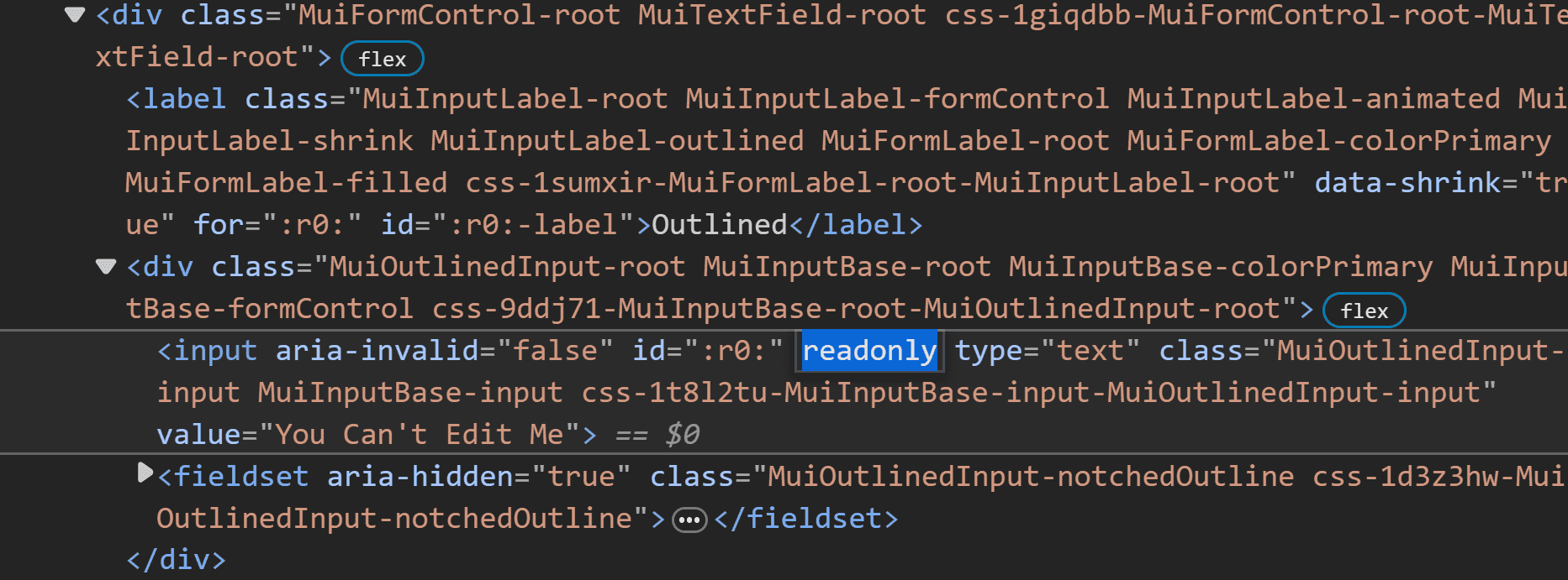
We can see that the readonly attribute is added to the input element, which is nested inside the root div element.
Alternatively, we can create our own custom TextField component that extends MUI TextField and pass in a new prop called readOnly, which will be used to set the inputProps value. This approach is particularly useful when reusing it in multiple places.
import React from "react";
import MuiTextField from "@mui/material/TextField";

// Add to a separate file TextField.js
function TextField({ readOnly, ...props }) {
  return <MuiTextField {...props} inputProps={{ readOnly }} />;
}

export default function App() {
  return (
    <TextField
      label="Readonly"
      variant="outlined"
      defaultValue="You Can't Edit Me"
      readOnly
    />
  );
}
We renamed the MUI TextField component to MuiTextField to avoid naming conflict with our custom component. Now we have a custom TextField component that can quickly turn on a readonly mode. Of course, extending components can also help create other features such as validation, formatting, etc.
Style a Readonly TextField
Styling a Readonly TextField in MUI can be tricky. Since the component is a wrapper with different elements, changing styles will persist whether a readonly attribute is present or not. To get around this, we can use the CSS :has selector on the root element to check if it has the readonly prop.
In the example below, we can change the border and label color of the TextField to #cecece only when triggering readonly.
import React from "react";
import { TextField as MuiTextField } from "@mui/material";

function TextField({ readOnly, ...props }) {
  return (
    <MuiTextField
      inputProps={{ readOnly }}
      sx={{
        // change label and border color when readonly
        "&:has([readonly]) ": {
          "& .MuiInputLabel-outlined": {
            color: "#cecece",
          },
          "& .MuiOutlinedInput-notchedOutline": {
            borderColor: "#cecece",
          },
        },
      }}
      {...props}
    />
  );
}

export default function App() {
  return (
    <TextField
      label="Readonly"
      variant="outlined"
      defaultValue="You Can't Edit Me"
      readOnly
    />
  );
}
Note: thre is an active issue to add a Mui-readOnly class to the root element. When resolved, we won’t require the :has selector anymore since we can directly target the class.
Another approach is to change the styles dynamically based on the readOnly prop value. Each class object can be a function that returns the styles based on the condition.
import React from 'react';
import MuiTextField from '@mui/material/TextField';

function TextField({ readOnly, ...props }) {
  return (
    <MuiTextField
      inputProps={{ readOnly }}
      sx={{
        '& .MuiInputLabel-outlined': () =>
          readOnly
            ? {
                color: '#cecece',
              }
            : null,
        '& .MuiOutlinedInput-notchedOutline': () =>
          readOnly
            ? {
                borderColor: '#cecece',
              }
            : null,
      }}
      {...props}
    />
  );
}

export default function App() {
  return (
    <TextField
      label="Readonly"
      variant="outlined"
      defaultValue="You Can't Edit Me"
      readOnly
    />
  );
}
We are returning null because if readOnly is false, then we’re keeping the default style. Of course, we can change the default however we like.
Styling Different Variants
The TextField component has different variants such as standard, outlined, and filled. Previously, we only styled the outlined variant. To style the other variants, we must change the selector’s class name.
For example, we can use the following class selector to style the border and label colors of the filled variant.
import React from "react";
import MuiTextField from "@mui/material/TextField";

function TextField({ readOnly, ...props }) {
  return (
    <MuiTextField
      inputProps={{ readOnly }}
      sx={{
        "&:has([readonly]) ": {
          "& .MuiInputLabel-filled": {
            color: "#cecece",
          },
          "& .MuiFilledInput-root": {
            "&:before": {
              borderBottom: "1px solid #cecece",
            },
          },
        },
      }}
      {...props}
    />
  );
}

export default function App() {
  return (
    <TextField
      label="Readonly"
      variant="filled"
      defaultValue="You Can't Edit Me"
      readOnly
    />
  );
}
If we want to style the standard variant, we can do the following.
import React from "react";
import MuiTextField from "@mui/material/TextField";

function TextField({ readOnly, ...props }) {
  return (
    <MuiTextField
      inputProps={{ readOnly }}
      sx={{
        "&:has([readonly]) ": {
          "& .MuiInputLabel-standard": {
            color: "#cecece",
          },
          "& .MuiInput-root": {
            "&:before": {
              borderBottom: "1px solid #cecece",
            },
          },
        },
      }}
      {...props}
    />
  );
}

export default function App() {
  return (
    <TextField
      label="Readonly"
      variant="standard"
      defaultValue="You Can't Edit Me"
      readOnly
    />
  );
}
Using the Theme
MUI provides a createTheme function that can be used to create a new theme and override the default styles. This is useful when we want the readonly styles to be applied globally.
import React from "react";
import { createTheme, ThemeProvider } from "@mui/material/styles";
import TextField from "@mui/material/TextField";

const theme = createTheme({
  components: {
    MuiTextField: {
      styleOverrides: {
        root: {
          "&:has([readonly]) ": {
            "& .MuiInputLabel-outlined": {
              color: "#cecece",
            },
            "& .MuiOutlinedInput-notchedOutline": {
              borderColor: "#cecece",
            },
          },
        },
      },
    },
  },
});

export default function BasicTextFields() {
  return (
    <ThemeProvider theme={theme}>
      <TextField
        label="Readonly"
        variant="outlined"
        defaultValue="You Can't Edit Me"
        inputProps={{ readOnly: true }}
      />
    </ThemeProvider>
  );
}
Now, anywhere we use the MUI TextField component the readonly mode will be styled based on the custom theme.
For more details on creating and customizing themes and colors, refer to this in-depth guide.
Summary
In this tutorial, we learned how to create a Readonly TextField in Material UI (MUI) and React with customization and styling on different variants. Using the Theme, we also discovered how to style the readonly TextField globally.
Bye for now 👋


