


Developers always want to showcase or share their work, whether that’s through GitHub projects, technical blogs, or personal portfolios. Personally, I’ve found that writing blogs not only helps others, but also deepens my own knowledge and makes me more confident when working with teams and contributing to the community.
I’ve rebuilt my blog and portfolio site three times already, and finally decided it was time to make it modular, scalable, and easy to maintain. So I built a Next.js starter that’s not only developer-friendly, but actually fun to work with.
It comes with a bunch of useful features out of the box:
- Dark mode with token-based theming
- Dynamic Table of Contents (TOC) for each article
- MDX support with code highlighting built-in
- Optimized performance (90–100% Lighthouse scores)
- Clean component-based architecture for easy customization
- SEO-friendly with metadata and semantic URLs
- Simplistic and beautiful design
In this tutorial, I’ll walk you through, step by step, how to build a blog and portfolio site using Next.js and Material UI (MUI). It will cover a well structured nextjs template to start from and customize it to your liking.
Before we dive in, here’s a quick demo of the starter, a live version, and a link to the repo:
GitHub Repo: nextjs starter repository
Live Demo: nextjs blog demo
Next.js Setup
Alright, let’s get the foundation in place with a fresh Next.js project. If you’ve done this before, feel free to skim.
Create the project
In your terminal, run:
npx create-next-app@latest nextjs-mui-blog-starterYou’ll get a few prompts, things like TypeScript, App Router, Tailwind, etc. You can go with the defaults or tweak settings based on your preferences. The only must-do? Include the App Router, and skip Tailwind—we’re going with Material UI for this one (no hate on Tailwind; it’s just not what we’re using here).
This setup uses the app/ directory structure introduced in Next.js 13, which supports layouts and routing optimized for both performance and clarity.
Run the dev server
Once the setup finishes, go ahead and jump into the new directory:
cd nextjs-mui-blog-starter
npm run dev
You should see the usual Next.js welcome screen at http://localhost:3000. Nice!
Pro tip: In package.json, you can modify the port to run your app on a different one, like 9000. Modify "dev": "next dev -p 9000" in the scripts section.
Material UI Setup
Now that Next.js is ready, let’s bring in Material UI (MUI) to style our application with a powerful and responsive component library. We’ll set up MUI into the project and shape a cohesive nextjs theme that’s consistent and accessible.
Install Material UI
To get started, install MUI along with its required dependencies:
npm install @mui/material @emotion/react @emotion/styled @mui/material-nextjs @emotion/cacheMUI uses Emotion as its default styling engine. No need for global stylesheets or external CSS frameworks.
The @mui/material-nextjs package simplifies server-side rendering with MUI in the Next.js App Router. Without it, you’d need to manually handle Emotion cache, inject styles into HTML streams, and manage SSR hydration mismatches.
Clean Up and Configure MUI
Before adding custom components, let’s do a quick cleanup and MUI setup:
- Delete global CSS files like
globals.cssandpage.module.css; we’ll use MUI’sCssBaselineinstead. - Remove the content in
page.tsxso it starts clean.
export default function Home() {
  return <div></div>;
}- Update
layout.tsxto configure MUI’s SSR support and add a global style baseline:
import { CssBaseline } from "@mui/material";
import { AppRouterCacheProvider } from "@mui/material-nextjs/v15-appRouter";

export default function RootLayout({
  children,
}: Readonly<{
  children: React.ReactNode;
}>) {
  return (
    <html lang="en">
      <body>
        <AppRouterCacheProvider>
          <CssBaseline />
          {children}
        </AppRouterCacheProvider>
      </body>
    </html>
  );
}-
AppRouterCacheProvider: Handles MUI’s server-generated styles as Next.js streams the page to the browser (learn more) -
CssBaseline: Applies consistent base styles (typography, color, layout) across browsers (learn more)
At this point, your app should render a clean, white page with no default Next.js styles.
Test MUI with a Header Component
Let’s test that MUI is working by building a quick header with navigation:
components/Header.tsx
// Simple MUI AppBar component to validate Material UI setup
import AppBar from "@mui/material/AppBar";
import Toolbar from "@mui/material/Toolbar";
import Typography from "@mui/material/Typography";
import Button from "@mui/material/Button";

export default function Header() {
  return (
    <AppBar position="static">
      <Toolbar>
        <Typography variant="h6" mr={5}>
          My Blog
        </Typography>
        <Button color="inherit">Home</Button>
        <Button color="inherit">Blog</Button>
        <Button color="inherit">About</Button>
      </Toolbar>
    </AppBar>
  );
}
Then update layout.tsx to include the Header:
import { CssBaseline } from "@mui/material";
import { AppRouterCacheProvider } from "@mui/material-nextjs/v15-appRouter";
import Header from "./components/Header";

export default function RootLayout({
  children,
}: Readonly<{
  children: React.ReactNode;
}>) {
  return (
    <html lang="en">
      <body>
        <AppRouterCacheProvider>
          <CssBaseline />
          <Header />
          {children}
        </AppRouterCacheProvider>
      </body>
    </html>
  );
}
If you see a blue top bar with “My Blog” and three navigation buttons, MUI is now integrated and rendering correctly!
MDX Setup
Now that we have Next.js and Material UI wired up, let’s add the ability to write blog posts using MDX, Markdown with embedded JSX.
Install MDX Dependencies
MDX is one of the most flexible ways to author content in a React-based site, allowing your nextjs blog to support markdown with interactive components.
To get started, install the required packages:
npm install @next/mdx @mdx-js/loader @mdx-js/react @types/mdxConfigure Next
Next, we’ll update the next.config.ts file to enable .mdx pages to be routed like normal React components:
import withMdx from "@next/mdx";

const nextConfig = {
  pageExtensions: ["ts", "tsx", "js", "jsx", "mdx"],
};

const mdxConfig = {
  // You can add remark/rehype plugins here
};

export default withMdx(mdxConfig)(nextConfig);
This configuration tells Next.js to treat .mdx files as valid page routes. The @next/mdx plugin automatically compiles them into React components that render just like .tsx files.
Add Components Mapping
With the App Router, we also need to define custom component mappings for MDX rendering.
We can achieve this by creating a new file called mdx-components.tsx at the root of the src/ directory:
import type { MDXComponents } from "mdx/types";

export function useMDXComponents(components: MDXComponents): MDXComponents {
  return {
    ...components,
  };
}
The useMDXComponents hook allows us to customize how MDX elements are rendered throughout the application.
Create a Test Blog Post
Let’s create a simple blog post to verify everything is working.
-
Inside the
app/directory, create a folder calledblogs/ -
Inside
blogs/, create a new folder:my-first-blog-post/ -
Inside that folder, create a file named
page.mdx
# Introduction

Welcome to my first blog post! In this post, I’ll share my journey of learning Next.js and Material UI. Stay tuned for more!

## Setup

To get started, we’ll install the latest Next.js version and create a new project:

```bash
npx create-next-app@latest nextjs-mui-blog-starter
```
Now navigate to http://localhost:3000/blogs/my-first-blog-post and boom, your MDX content should render just like any other page!
How It Works
The App Router in Next.js makes this possible by treating folders as route segments. Since page.mdx is a valid route file, it gets compiled and rendered automatically, just like page.tsx.
We can nest routes, use dynamic segments (like [slug]), or structure our blog by date, tag, or category. All with native file-system routing.
Final Structure Overview
Here’s what your project should now look like:
nextjs-mui-blog-starter
├── app
│ ├── blogs
│ │ └── my-first-blog-post
│ │   └── page.mdx
│ ├── components
│ │ └── Header.tsx
│ ├── layouts
│ │ └── layout.tsx
├── mdx-components.tsx
├── next.config.ts
├── package.json
└── tsconfig.json
Building a Blog
Now that the foundation is in place, let’s start building the actual blog experience. This is where things get fun and a bit more dynamic.
Understanding Dynamic Routing
Next.js App Router supports dynamic segments using square brackets like [slug]. That is perfect for content-driven pages such as blogs, docs, or portfolios because the URL becomes the source of truth for which content to render.
SEO Tip: Using slug-based folders and filenames keeps URLs semantic and helps both search engines and generative engines map each route to a specific content source.
Let’s break it down:
A folder named [slug] inside app/blogs/ tells Next.js that anything matching /blogs/\* should be routed to this segment.
When a request comes in (e.g., /blogs/my-first-post), the part after /blogs/ (my-first-post) is passed as a parameter to your route.
You can then use that slug to fetch content, metadata, and render it dynamically.
Loading Dynamic Content
Inside app/blogs/, we’ll create [slug]/page.tsx. Start with a minimal page so routing is set up cleanly:
import { readdirSync } from "fs";
import path from "path";

interface BlogPostPageProps {
  params: { slug: string };
}

export default async function BlogPostPage({ params }: BlogPostPageProps) {
  const { slug } = await params;
  return (
    <div>
      <h1>{slug}</h1>
    </div>
  );
}

// Return all slugs for SSG
export async function generateStaticParams() {
  const blogDir = path.join(process.cwd(), "content/blogs");
  const slugs = readdirSync(blogDir);
  return slugs.map(slug => ({ slug }));
}
What’s happening here?
generateStaticParamstells Next.js which paths to statically pre-render at build time.- We’re scanning the blog directory and generating a list of slugs based on folder names.
- The
[slug]parameter becomes available inside theBlogPostPagecomponent, giving us dynamic access to the requested post.
Important routing note
When visiting http://localhost:3000/blogs/my-first-blog-post, you may still see the original static page we created inside app/ instead of the dynamic one with the slug value. Next.js gives static routes precedence over dynamic ones inside the project. To avoid unexpected behavior and keep the content separate from the project’s main routing, store all blog posts in a top-level content/blogs folder outside app/. Think of content/ as your CMS or database. It prevents accidental route collisions and keeps the App Router focused on UI, not raw content files.
A clean layout looks like this:
nextjs-mui-blog-starter
├── src
│ ├── app
│ │ └── blogs
│ │ └── [slug]
│ │ └── page.tsx
├── content
│ ├── blogs
│ │ ├── my-first-blog-post
│ │ │ └── page.mdx
│ │ └── my-second-blog-post
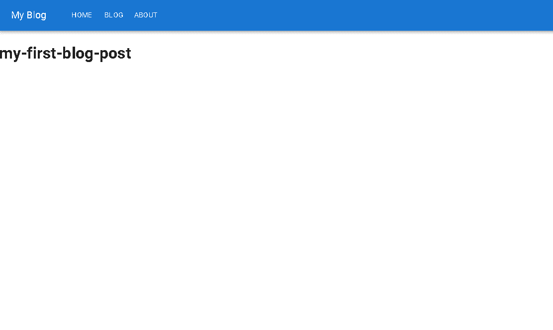
│ │ └── page.mdxAt this point, visiting http://localhost:3000/blogs/my-first-blog-post should display the slug, but no content yet.
Loading MDX Content
With React 19, next-mdx-remote has not been updated and has known issues. We will use next-mdx-remote-client instead. It works well with the App Router and keeps MDX rendering on the server in an RSC-friendly fashion.
npm install next-mdx-remote-clientIn app/blogs/[slug]/page.tsx, we will update the code to load and render each post:
import { readdirSync, readFileSync } from "fs";
import { MDXRemote } from "next-mdx-remote-client/rsc";
import path from "path";

interface BlogPostPageProps {
  params: { slug: string };
}

export default async function BlogPostPage({ params }: BlogPostPageProps) {
  const { slug } = await params;

  const filePath = path.join(
    process.cwd(),
    "content",
    "blogs",
    slug,
    "page.mdx"
  );
  const fileContents = readFileSync(filePath, "utf8");

  return (
    <div>
      <h1>{slug}</h1>
      <MDXRemote source={fileContents} />
    </div>
  );
}

// Return all slugs for SSG
export async function generateStaticParams() {
  const blogDir = path.join(process.cwd(), "content/blogs");
  const slugs = readdirSync(blogDir);
  return slugs.map(slug => ({ slug }));
}
What this does
- Reads the
.mdxfile for the requested slug fromcontent/blogs/<slug>/page.mdx. - Renders it with
<MDXRemote source={fileContents} />.
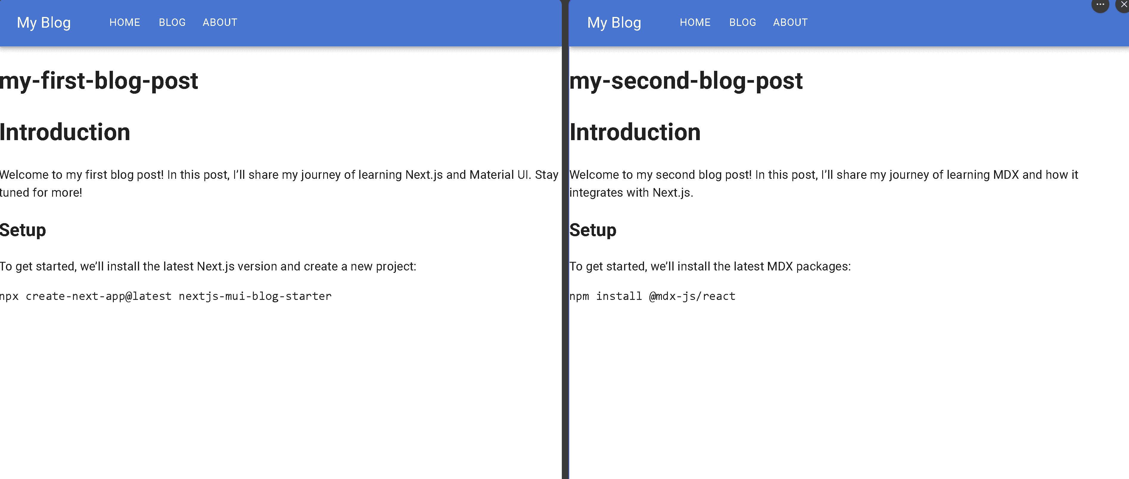
To test this out on multiple blogs, we can create another folder and MDX file for a new blog post.
content/blogs/my-second-blog-post/page.mdx
# Introduction

Welcome to my second blog post! In this post, I’ll share my journey of learning MDX and how it integrates with Next.js.

## Setup

To get started, we’ll install the latest MDX packages:

```bash
npm install @mdx-js/react
```
If everything is set up correctly, visiting the following URLs should render the respective blog posts:
Frontmatter and Metadata
Frontmatter is a block of structured data (usually in YAML or JSON) placed at the top of Markdown or MDX files. It’s commonly used to store metadata like:
- Title
- Description
- Date
- Author
- Tags
This metadata helps you build SEO-friendly pages, dynamic lists of posts, and consistent layouts. All without hardcoding details into the component.
Add Frontmatter to Blog Posts
Let’s update each post with a frontmatter block as follows:
my-first-blog-post/page.mdx
---
title: My First Blog Post
description: Welcome to my first blog post! In this post, I will share my journey of learning Next.js and Material UI. Stay tuned for more exciting content!
date: "2022-01-01"
author: Mareli Ramos
tags: nextjs, material-ui
---

# Introduction

Your content goes here...
my-second-blog-post/page.mdx
---
title: My Second Blog Post
description: Welcome to my second blog post! This is a page created using MDX.
date: "2022-01-02"
author: Mareli Ramos
tags: mdx, react
---

# Introduction

Your content goes here...
Parsing Frontmatter
To extract frontmatter from each post, we’ll use the gray-matter package. It’s fast, lightweight, and handles both YAML and JSON.
npm install gray-matterIn app/blogs/[slug]/page.tsx, extract frontmatter and render it alongside the MDX content:
import { readdirSync, readFileSync } from "fs";
import matter from "gray-matter";
import { MDXRemote } from "next-mdx-remote-client/rsc";
import path from "path";

interface BlogPostPageProps {
  params: { slug: string };
}

export default async function BlogPostPage({ params }: BlogPostPageProps) {
  const { slug } = await params;
  const filePath = path.join(
    process.cwd(),
    "content",
    "blogs",
    slug,
    "page.mdx"
  );
  const fileContents = readFileSync(filePath, "utf8");

  const { content, data: frontmatter } = matter(fileContents);

  return (
    <div>
      <h1>{frontmatter.title}</h1>
      <p>{frontmatter.date}</p>
      <p>{frontmatter.author}</p>
      <p>{frontmatter.description}</p>
      <p>{frontmatter.tags}</p>
      <MDXRemote source={content} />
    </div>
  );
}
// Scans the content/blogs folder to return all slugs for SSG
export async function generateStaticParams() {
  const blogDir = path.join(process.cwd(), "content/blogs");
  const slugs = readdirSync(blogDir);
  return slugs.map(slug => ({ slug }));
}
At this point, when you visit the URLs:
http://localhost:3000/blogs/my-first-blog-post
http://localhost:3000/blogs/my-second-blog-post
You’ll see not only the blog content, but also all the metadata rendered above it.
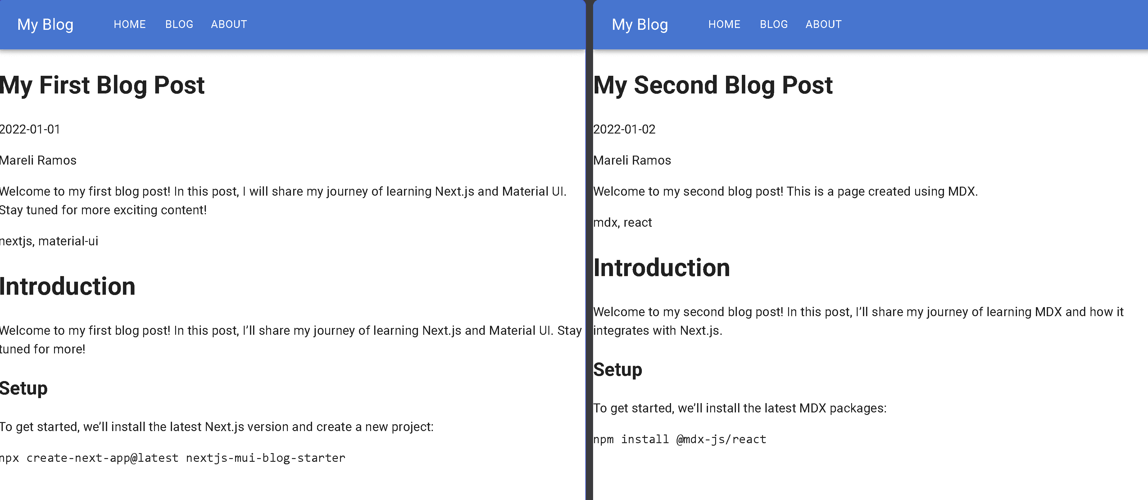
Table of Contents (TOC)
A Table of Contents (TOC) is more than just a list—it’s a navigation boost for both your readers and search engines. It helps readers quickly jump to the content they need and gives search engines a clearer understanding of your page structure, which can even improve your chances of getting rich results in search.
Instead of maintaining one manually, we’ll generate a dynamic TOC based on the headings inside each blog post. This way, your TOC stays accurate and updated, no extra work required.
Install Required Packages
We’ll use a few handy libraries to parse and walk through the content tree:
npm install unified remark-parse remark-mdx unist-util-visit rehype-slugI know that might seem like a lot, but they’re lightweight, efficient, and save us from manually parsing all the edge cases.
Here’s what we’re using:
- unified – the core processor for parsing and transforming content
- remark-parse – parses raw Markdown into an AST (abstract syntax tree)
- remark-mdx – enables MDX parsing
- unist-util-visit – allows us to traverse the AST efficiently
- rehype-slug – generates slug IDs for heading elements
Extracting Headings
Let’s create a new function in app/blogs/[slug]/page.tsx that extracts all heading nodes from the MDX content:
...

import { unified } from "unified";
import remarkParse from "remark-parse";
import remarkMdx from "remark-mdx";
import { visit } from "unist-util-visit";

...

interface Heading {
  depth: number;
  text: string;
  slug: string;
}

...

export async function extractHeadings(content: string): Promise<Heading[]> {
  const headings: Heading[] = [];

  const processor = unified().use(remarkParse).use(remarkMdx);
  const ast = processor.parse(content);

  visit(ast, "heading", (node: any) => {
    const text = node.children.map((child: any) => child.value).join("");
    headings.push({
      depth: node.depth,
      text,
      slug: text
        .toLowerCase()
        .replace(/\s+/g, "-")
        .replace(/[^\w-]/g, ""), // Convert to slug-friendly format. E.g. "My Heading" -> "my-heading"
    });
  });

  return headings;
}
This function walks through the Markdown AST and returns all headings with their text, level (e.g., h2, h3), and a slug for anchor links.
Now, we should update the BlogPostPage component to use this function and render the TOC.
...

import rehypeSlug from "rehype-slug";

export default async function BlogPostPage({ params }: BlogPostPageProps) {
  const { slug } = await params;
  const filePath = path.join(
    process.cwd(),
    "content",
    "blogs",
    slug,
    "page.mdx"
  );
  const fileContents = readFileSync(filePath, "utf8");

  const { content, data: frontmatter } = matter(fileContents);
  const headings = await extractHeadings(content);

  return (
    <div>
      <h1>{frontmatter.title}</h1>
      <p>{frontmatter.date}</p>
      <p>{frontmatter.author}</p>
      <p>{frontmatter.description}</p>
      <p>{frontmatter.tags}</p>
      {/* Render TOC */}
      <ul>
        {headings?.map(({ text, slug, depth }) => (
          <li key={slug} style={{ marginLeft: `${depth - 1}rem` }}>
            <a href={`#${slug}`}>{text}</a>
          </li>
        ))}
      </ul>
      <MDXRemote
        source={content}
        options={{
          mdxOptions: { rehypePlugins: [rehypeSlug] },
          parseFrontmatter: true,
        }}
      />
    </div>
  );
}

...
rehypeSlug is added to the rehypePlugins array prop in MDXRemote to automatically generate id attributes for heading elements. These ids are derived from the heading text and make it possible to create anchor links.
In case you’re not familiar with rehype, it’s part of the Unified ecosystem, a powerful plugin system that transforms HTML content into an abstract syntax tree (AST). This makes it easy to manipulate, enhance, or even sanitize content during compilation.
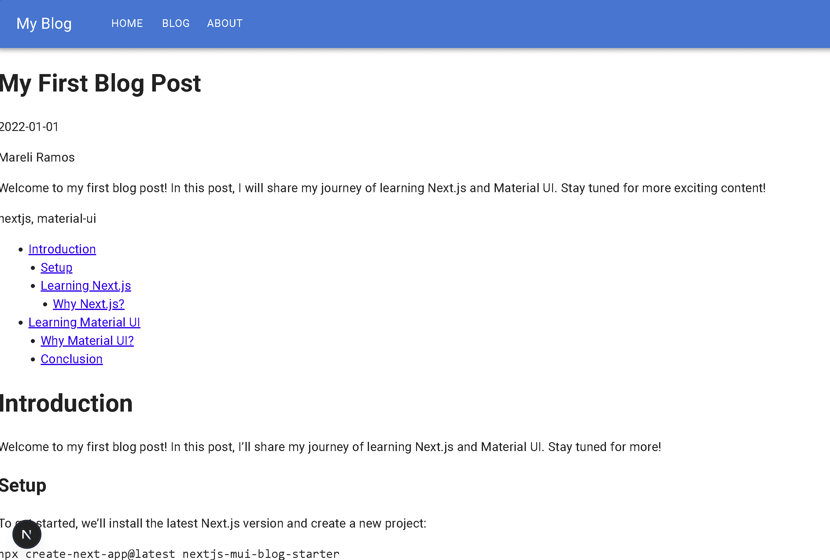
With rehypeSlug in place and our extractHeadings function doing its job, we now render a clean Table of Contents where each item links to its respective section. We also use the depth value in HTML to adjust indentation and reflect the heading hierarchy visually.
Let’s test it out and update my-first-blog-post with additional heading levels like this:
## Learning Next.js

### Why Next.js?

# Learning Material UI

## Why Material UI?

## Conclusion
Navigate to http://localhost:3000/blogs/my-first-blog-post and you’ll now see a clickable TOC that anchors to each section of the article.
Code Highlighting
Code highlighting is one of those small touches that makes a huge difference, both for your readers and your own readability when revisiting code-heavy posts.
After trying out several options over the years, I found Shiki to offer the perfect balance between performance, theming flexibility, and developer experience. It’s lightweight, fast, and customizable enough to fit nicely into your blog design.
Install Shiki and Rehype Plugin
We’ll use Shiki in combination with rehype-pretty-code, a rehype plugin that integrates Shiki for syntax highlighting.
npm install shiki rehype-pretty-codeConfigure Code Highlighting in MDX Compiler
Let’s update app/blogs/[slug]/page.tsx file to apply syntax highlighting via rehypePrettyCode:
...

import rehypePrettyCode from "rehype-pretty-code";

...

// Inside MDXRemote component
<MDXRemote
  source={content}
  options={{
    mdxOptions: {
      rehypePlugins: [
        rehypeSlug,
        [
          rehypePrettyCode,
          {
            theme: "github-dark", // or 'nord', 'dracula', etc.
            keepBackground: true,
          },
        ],
      ],
    },
    parseFrontmatter: true,
  }}
/>;
This tells the compiler to:
- Style code blocks using the
github-darktheme (you can customize it) - Preserve any background color defined by the theme with
keepBackground: true
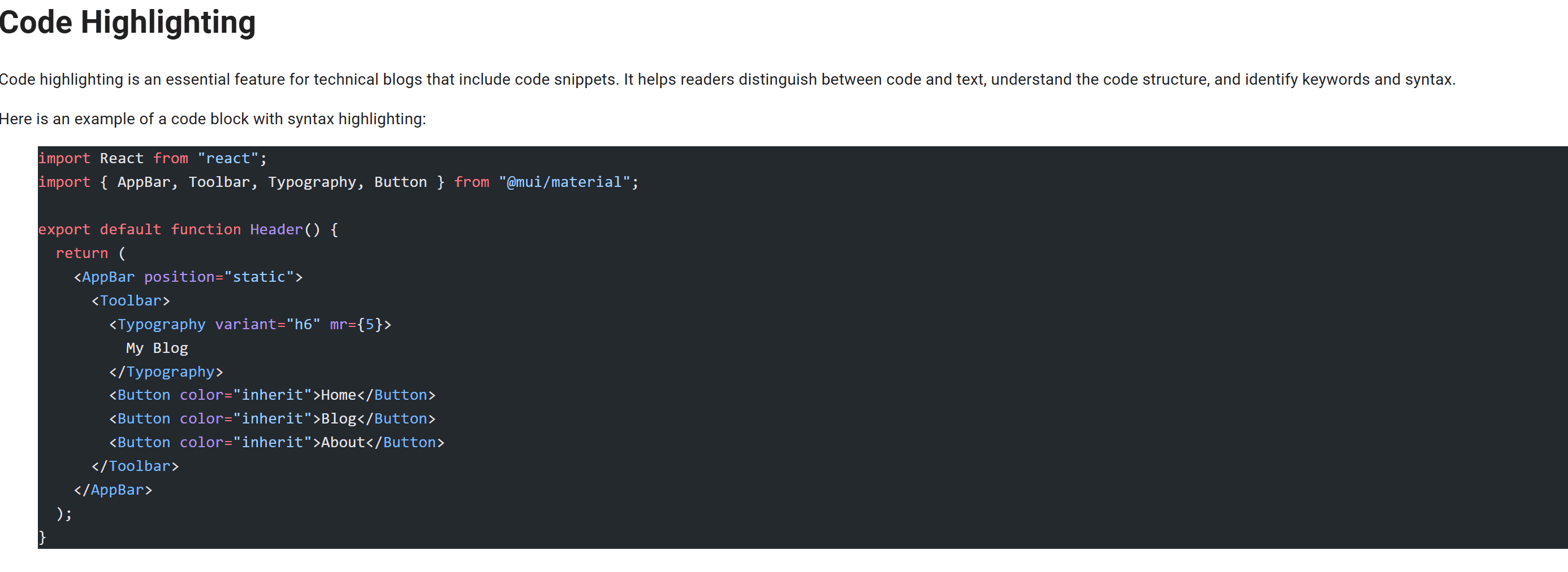
Let’s add a code snippet to the MDX blog post and see it in action:
# Code Highlighting

Here’s an example of a simple MUI-powered header component:

```jsx
import React from "react";
import { AppBar, Toolbar, Typography, Button } from "@mui/material";

export default function Header() {
  return (
    <AppBar position="static">
      <Toolbar>
        <Typography variant="h6" mr={5}>
          My Blog
        </Typography>
        <Button color="inherit">Home</Button>
        <Button color="inherit">Blog</Button>
        <Button color="inherit">About</Button>
      </Toolbar>
    </AppBar>
  );
}
```
Now when visiting http://localhost:3000/blogs/my-first-blog-post, you should see the syntax-highlighted block rendered with smooth, github-theme like styling, no manual styling needed. Hooray!
Using React Components in MDX
One of MDX’s best features is the ability to embed React components directly inside Markdown content.
This means we’re no longer limited to static code examples. We can actually render live components within posts, perfect for interactive demos, UI previews, or teaching by example.
Imagine writing a React tutorial and showing a simple counter. Instead of only pasting the code, your readers can see it in action and interact with it.
Create a React Component
Let’s create a basic Counter component inside the components folder:
// components/Counter.tsx
"use client";
import { useState } from "react";

export default function Counter() {
  const [count, setCount] = useState(0);

  return (
    <div>
      <button onClick={() => setCount(c => c - 1)}>-</button>
      <span>{count}</span>
      <button onClick={() => setCount(c => c + 1)}>+</button>
    </div>
  );
}
"use client" in the first line is required to make this a client component, since it uses state and interactivity. The default behavior in Next.js is to render components on the server.
This is a simple component, but we can get creative and build more advanced widgets like tabbed examples, theme toggles, or custom UI cards.
Use Component in MDX
To use a component inside any .mdx blog post, we need to expose it to the MDX compiler by passing it via the components prop in MDXRemote.
import Counter from "@/components/Counter";

...

 <MDXRemote
        source={content}
        components={{ Counter }} // or add more components here. E.g. { Counter, Alert, Tabs }
        options={{
          mdxOptions: {
            rehypePlugins: [
              rehypeSlug,
              [
                rehypePrettyCode,
                {
                  theme: "github-dark", // or 'nord', 'dracula', etc.
                  keepBackground: true,
                },
              ],
            ],
          },
          parseFrontmatter: true,
        }}
      />
...
Now in any blog post, we can just write:
# Interactive Counter Example

Here’s a simple counter component you can interact with:

```tsx
import { useState } from "react";
export default function Counter() {
  const [count, setCount] = useState(0);
  return (
    <div>
      <button onClick={() => setCount(c => c - 1)}>-</button>
      <span>{count}</span>
      <button onClick={() => setCount(c => c + 1)}>+</button>
    </div>
  );
}
```

<Counter />
In the demo video below, you can see how the counter component renders live inside the MDX content, allowing readers to interact with it directly.
Creating a List of Blog Posts
Now that we’ve got multiple posts up and running, let’s build a clean /blogs listing page to show them off, complete with tag-based filtering for a better browsing experience.
Create the blogs Page
Thanks to the power of the Next.js App Router, we can simply create a page.tsx file inside the blogs folder and it’ll automatically be available at /blogs.
Your project structure should look like this:
nextjs-mui-blog-starter
├── src
│   ├── app
│   │   ├── blogs
│   │   │   ├── [slug]
│   │   │   │   └── page.tsx
│   │   │   └── page.tsx   ← our new blogs listing page
├── content
│   └── blogs
│       └── my-first-blog-post
│ └── my-second-blog-post- The
app/blogs/[slug]/page.tsxfile defines a dynamic route in the App Router. It acts as a template that loads and renders each blog post based on its unique slug (e.g.,/blogs/my-first-post). content/blogs/holds the blog post MDX files with frontmatterapp/blogs/page.tsxis the blog listing page
Let’s add the following code in app/blogs/page.tsx to display a list of all blog posts by extracting their frontmatter:
import fs from "fs";
import path from "path";
import matter from "gray-matter";
import Link from "next/link";
const blogsDirectory = path.join(process.cwd(), "content", "blogs");
export default function BlogsPage() {
const blogFolders = fs.readdirSync(blogsDirectory);
const allBlogs = blogFolders.map(folder => {
const filePath = path.join(blogsDirectory, folder, "page.mdx");
const fileContent = fs.readFileSync(filePath, "utf-8");
const { data: frontmatter } = matter(fileContent);
return {
slug: folder,
...frontmatter,
};
});
return (
<div>
<h1>All Blog Posts</h1>
<ul>
{allBlogs.map((blog: any) => (
<li key={blog.slug}>
<Link href={`/blogs/${blog.slug}`}>
<h2>{blog.title}</h2>
<p>{blog.description}</p>
</Link>
</li>
))}
</ul>
</div>
);
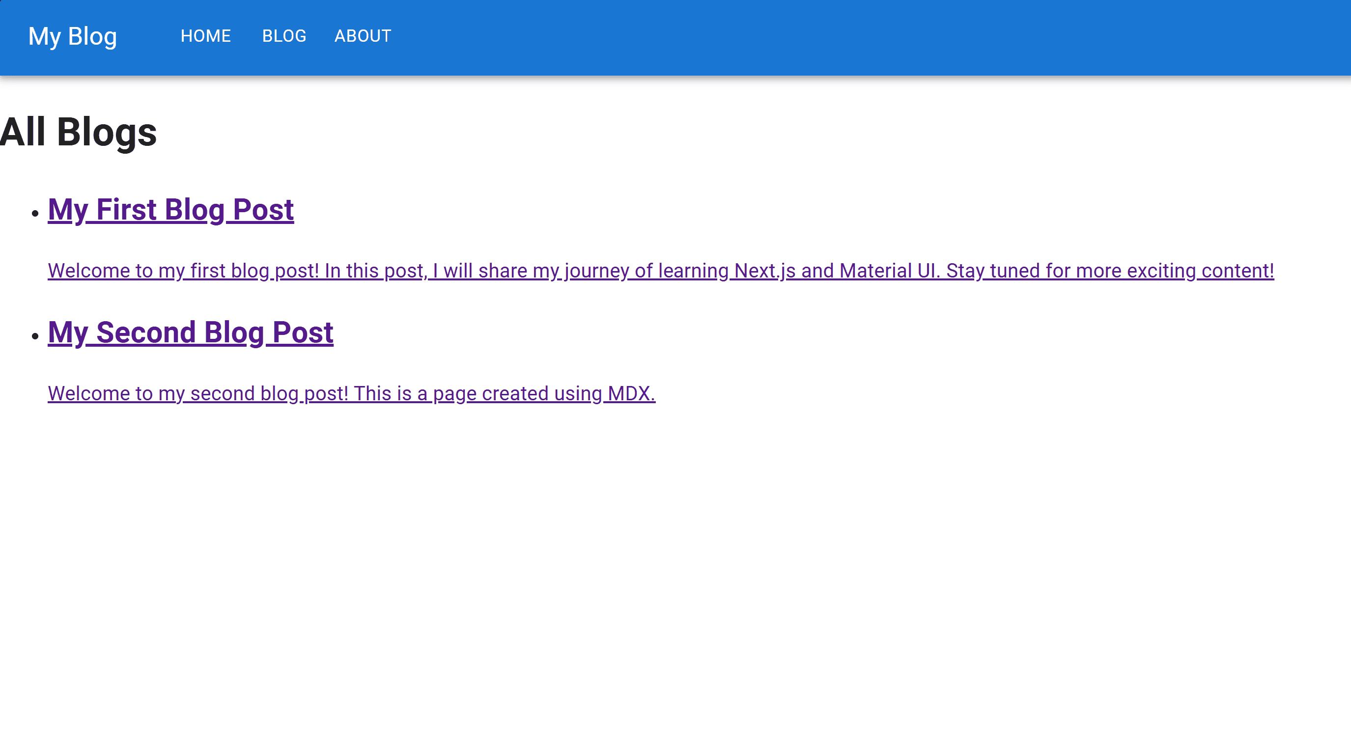
}Similar to the app/blogs/[slug]/page.tsx file, which handles dynamic routing and displays a single blog post based on the URL slug, this page will iterate through the entire content directory, extract the metadata (frontmatter) from each post, and render them as a list.
Now, when you navigate to http://localhost:3000/blogs, you should see a clean list of all the blog posts with titles and descriptions.
SEO Tip: Use meaningful <h1>, <h2> elements and meta descriptions per blog for better indexing.
Filtering Blog Posts
Given that you’re on your way to becoming a blogging superstar, it makes sense to give your readers a way to easily filter and explore your posts based on topics they care about.
Since we already added tags to the frontmatter of each blog post, let’s build a simple but powerful filter system based on those tags.
We’ll start by adding searchParams to the BlogsPage component. This allows us to capture the selected tag from the URL and use it to filter posts:
export default function BlogsPage({
  searchParams,
}: {
  searchParams: { tag?: string };
}) {
  const selectedTag = searchParams?.tag;

  ...
}
Thanks to the awesome App Router in Next.js 13+, searchParams is available directly in server components. No need for extra hooks or client-side tricks.
Now let’s filter the blog posts using the selected tag:
const filteredBlogs = selectedTag
  ? allBlogs.filter((blog: any) => blog.tags?.includes(selectedTag))
  : allBlogs;
This ensures that only posts matching the selected tag are shown. Pretty handy when your content library starts to overflow with posts.
And here’s how it all comes together in BlogsPage component:
import fs from "fs";
import path from "path";
import matter from "gray-matter";
import Link from "next/link";

const blogsDirectory = path.join(process.cwd(), "content", "blogs");

export default function BlogsPage({
  searchParams,
}: {
  searchParams: { tag?: string };
}) {
  const selectedTag = searchParams?.tag;

  const blogFolders = fs.readdirSync(blogsDirectory);

  const allBlogs = blogFolders
    .filter(folder => folder !== "page.tsx")
    .map(folder => {
      const filePath = path.join(blogsDirectory, folder, "page.mdx");
      const fileContent = fs.readFileSync(filePath, "utf-8");
      const { data: frontmatter } = matter(fileContent);

      return {
        slug: folder,
        ...frontmatter,
      };
    });

  const allTags = ["react", "material-ui", "mdx", "nextjs"]; // You can dynamically generate this too

  const filteredBlogs = selectedTag
    ? allBlogs.filter((blog: any) => blog.tags?.includes(selectedTag))
    : allBlogs;

  return (
    <div>
      <div>
        <h2>Tags</h2>
        <ul>
          {allTags.map(tag => (
            <li key={tag}>
              <Link
                href={`/blogs?tag=${tag}`}
                style={{
                  fontWeight: tag === selectedTag ? "bold" : "normal",
                }}
              >
                {tag}
              </Link>
            </li>
          ))}
        </ul>
      </div>
      <h1>All Blogs</h1>
      <ul>
        {filteredBlogs.map((blog: any) => (
          <li key={blog.slug}>
            <Link href={`/blogs/${blog.slug}`}>
              <h2>{blog.title}</h2>
              <p>{blog.description}</p>
            </Link>
          </li>
        ))}
      </ul>
    </div>
  );
}
We’re listing a static set of tags for now, just to keep things simple, but feel free to level up and dynamically extract tags from your blog content later.
In the template, each tag is rendered as a link. When a reader clicks on one, it updates the tag query param in the URL, triggering a filter that only shows blog posts matching that tag.
Now, if you head over to http://localhost:3000/blogs?tag=nextjs, you’ll see only the posts tagged with “nextjs”.
Design Tokens & Theme Configuration
From this section onward, we’ll shift focus to the design and theming side of things. We’ll explore how to create a consistent visual language using design tokens and custom theming. Code examples are all samples from the starter project. Anytime you need access to the full source, you can find it here on GitHub.
When it comes to styling large applications, or even moderately sized ones, consistency is key. And let’s be honest, guessing paddings and hex codes on the fly is a productivity killer. That’s where design tokens come in. Think of them as a visual grammar in your nextjs theme: reusable values for spacing, typography, colors, shadows, and more.
In this starter, we’ve structured tokens in a single source of truth: styles/tokens.ts.
Design Tokens in Action
Here’s a snippet from the tokens.ts file:
export const {
  font,
  spacing,
  shadows,
  colors,
  borderRadius,
  letterSpacing,
  lineHeight,
} = {
  colors: {
    primary: {
      100: "#f6fffa",
      200: "#e0fff4",
      300: "#b3ffe1",
      ...
    },
    secondary: {
      100: "#dbdce8",
      200: "#b7b9c8",
      300: "#8f92a6",
      ...
    },
    grey: {
      100: "#f8f9fb",
      200: "#f1f3f5",
      300: "#e9ecef",
      ...
    },
  },
  font: {
    size: {
      1: "1rem",
      2: "1.2rem",
      3: "1.6rem",
      ...
    },
  },
  spacing: {
    1: "0.4rem",
    2: "0.8rem",
    3: "1.2rem",
    ...
  },
  shadows: [
    "none",
    "0px 1px 3px rgba(0, 0, 0, 0.12), 0px 1px 2px rgba(0, 0, 0, 0.24)",
    "0px 3px 6px rgba(0, 0, 0, 0.16), 0px 3px 6px rgba(0, 0, 0, 0.23)",
    ...
  ],
  borderRadius: {
    small: "4px",
    medium: "7px",
    pill: "50px",
  },
  letterSpacing: {
    small: "0.5px",
    large: "1px",
  },
  lineHeight: {
    small: "1.3em",
    ...
  },
};
These token values are simple, semantic, and most importantly, predictable. No need to wonder “Was that padding 1.2rem or 1.6rem?” You just reach for spacing[3] or font.size[4], and you’re done.
In my setup, tokens cover:
- Spacing (in steps of 4px)
- Font sizes
- Color palettes (primary, secondary, grey, etc.)
- Shadows (scalable elevation system)
- Border radius, line height, letter spacing
This makes everything from Button to Banner look and feel like it came from the same brand playbook.
Creating the Theme
Now that we have our tokens, it’s time to wire them into the actual MUI theme using createTheme. Here’s a simplified look at how it comes together in theme.ts:
"use client";

import { createTheme } from "@mui/material";
import {
  borderRadius,
  colors,
  font,
  letterSpacing,
  lineHeight,
} from "./tokens";

const theme = createTheme({
  palette: {
    primary: {
      main: colors.primary[500],
    },
    secondary: {
      main: colors.secondary[500],
    },
  },
  typography: {
    letterSpacing: letterSpacing,
    lineHeight: lineHeight,
    ...font.size,
  },
  shape: {
    radius: borderRadius,
  },
});

export default theme;
As you can see, we’re not just dropping values randomly, we’re referencing our tokens throughout the theme. That means every sx prop or styled component across the app now has direct access to a design language that scales.
Why This Matters
You might be thinking: “Cool, but why not just use MUI’s defaults and tweak what I need?”
Totally fair. But using your own tokens gives you a few massive wins:
- Consistency across components and pages
- Easy theme switching (light/dark or even brand variants)
- Reusability across projects (yep, this token setup is portable)
In short: when your design decisions are abstracted as tokens, you write less custom CSS and spend more time building features that matter.
To get the theme showing up in the app, we need to wrap the root layout with MUI’s ThemeProvider:
import { ThemeProvider } from "@mui/material";
import theme from "./theme";

export default function RootLayout({ children }) {
  return <ThemeProvider theme={theme}>{children}</ThemeProvider>;
}
For an in-depth look at custom theming with MUI, check out my guide: Customizing Theme, Palette, and Colors with Material UI (MUI)
Section-Specific Palettes
One thing I like about this theme setup is that it doesn’t just define generic MUI palette keys, it also creates palette areas for specific sections of the site:
blog→ custom header background, h1 color, and code block styles.about→ custom section borders, title colors, and icon colors.postCard→ tag backgrounds.subscribe→ header text colors.
This keeps the styling logic organized and makes it very easy to change the look of an entire section without touching multiple components.
Example:
const theme = createTheme({
  palette: {
    primary: {
      main: colors.primary[500],
    },
    secondary: {
      main: colors.secondary[500],
    },
    blog: {
      headerBgColor: colors.secondary[100],
      h1Color: colors.secondary[500],
      preBorderColor: colors.secondary[300],
      codeBgColor: colors.grey[100],
      codeTextColor: colors.secondary[700],
    },
    about: {
      sectionBorderColor: colors.grey[300],
      titleColor: colors.primary[700],
      iconColor: colors.primary[500],
    },
    postCard: {
      tagBgColor: colors.grey[200],
    },
    subscribe: {
      headerTextColor: colors.primary[700],
    },
  },
});
Now when we want to style the blog header component, we can simply do:
const BlogHeader = () => {
  const theme = useTheme();
  return (
    <Box
      sx={{
        backgroundColor: "blog.headerBgColor",
        color: "blog.h1Color",
        ...
      }}
    >
      ...
    </Box>
  );
};
Extending the MUI Theme with Custom Types
Design tokens and theme configuration give us the structure. But if we’re serious about DX (Developer Experience), TypeScript is our best friend. Why guess what properties are available in the theme when we can get full IntelliSense and type safety?
This is where the magic of theme-types.d.ts comes in.
Extending MUI Theme Types
Let’s assume we want to add a custom blog section to the theme palette for blog-specific properties like header background color, h1 color, and code block styles.
// theme.ts
"use client";
import { createTheme } from "@mui/material";
import { colors } from "./tokens";

const theme = createTheme({
  palette: {
    primary: {
      main: colors.primary[500],
    },
    secondary: {
      main: colors.secondary[500],
    },
    blog: {
      headerBgColor: colors.secondary[100],
      h1Color: colors.secondary[500],
      preBorderColor: colors.secondary[300],
    },
  },
});

export default theme;
By default, MUI provides types for its palette, typography, and shape. But if we want to add custom theme sections like above, we need to tell TypeScript they exist. Otherwise, theme.palette.blog?.h1Color will just display red squiggles and sad vibes.
Let’s create a new file: theme-types.d.ts:
import "@mui/material/styles";

declare module "@mui/material/styles" {
  interface Palette {
    blog?: {
      headerBgColor: string;
      h1Color: string;
      preBorderColor: string;
    };
  }

  interface PaletteOptions {
    blog?: {
      headerBgColor: string;
      h1Color: string;
      preBorderColor: string;
    };
  }
}
We’re telling MUI:
“Hey, we’ve got some extra sections in our theme. Don’t worry, we’ll define what keys they have and what values they expect.”
We can also do the same for:
shape.radius(likesmall,medium,pill,circle)typography.letterSpacingtypography.lineHeight
declare module "@mui/material/styles/createTypography" {
  interface Typography {
    letterSpacing: LetterSpacing;
    lineHeight: LineHeight;
  }
  interface TypographyOptions {
    letterSpacing?: LetterSpacing;
    lineHeight?: LineHeight;
  }
}

declare module "@mui/system/createTheme/shape" {
  interface Shape {
    radius: BorderRadius;
  }
  interface ShapeOptions {
    radius: BorderRadius;
  }
}
Now when you’re inside a component and want to do:
const theme = useTheme();
console.log(theme.palette.blog?.h1Color); // ✅ No more red squiggles
You’ll get autocompletion and type checking. It’s like having a mini design system IDE right inside your editor.
Global Styles & Typography Setup
Before a single component hits the screen, we want to make sure we have a strong basis: standard spacing, font sizing, scrollbars, and responsive scaling across different browsers.
That’s exactly what we’ll do in global.tsx.
Setting Global Styles with MUI
MUI offers a GlobalStyles component that lets us apply baseline styles to the html, body, or any tag. In my setup, I’m using it to enforce:
fontSize(root rem base)fontFamily(from theme)- Custom scrollbar styles
- Full height for the
htmlelement
Here’s what it looks like:
import { GlobalStyles } from "@mui/material";

const globalStyles = (
  <GlobalStyles
    styles={theme => ({
      html: {
        height: "100%",
        fontSize: "62.5%",
        fontFamily: theme.typography.fontFamily,
        "&::-webkit-scrollbar": {
          width: 10,
        },
        "&::-webkit-scrollbar-track": {
          borderRadius: theme.shape.radius.small,
        },
        "&::-webkit-scrollbar-thumb": {
          background: theme.palette.grey[500],
          borderRadius: theme.shape.radius.medium,
        },
      },
    })}
  />
);

export default globalStyles;
Why fontSize: 62.5%?
This classic trick that sets the base 1rem = 10px. It’s a small touch that makes spacing and sizing math-friendly:
1.6rem → 16px2.4rem → 24px
This lines up beautifully with the font.size and spacing tokens from our design system.
To apply these styles globally, all we need to do is import and inject globalStyles inside layout.tsx or the root layout:
import globalStyles from "./styles/global";
...
  return (
    <ThemeProvider theme={theme}>
      {globalStyles}
      {children}
    </ThemeProvider>
  );
};
And voilà! Your app now has consistent scrollbars, base font sizes, and typography that flows from the theme. For more details regarding MUI global styling, I suggest reading this small tutorial I wrote: How to Create Global Styles in Material UI (MUI)
Typography Setup with Google Fonts
In theme.ts we’re importing Poppins from next/font/google, and setting it as the base theme font:
import { Poppins } from "next/font/google";
...

const poppins = Poppins({
  weight: ["100", "200", "300", "400", "500", "600", "700", "800", "900"],
  subsets: ["latin"],
  display: "swap",
});

...

const theme = createTheme({
  ...

  typography: {
    htmlFontSize: 10,
    fontFamily: poppins.style.fontFamily,
  },
});
This gives you:
- Smooth loading fonts (with
display: swap) - Strong visual identity from the get-go
htmlFontSizesets the base font to10pxto match our62.5%global style- And since this font setup is defined in the theme, every single component inherits it without needing to touch CSS.
Component-Level Styling Using Tokens
With a solid theme and design tokens in place, styling individual components becomes a breeze. You can leverage MUI’s sx prop and direct style props to apply consistent, theme-aware styles without writing custom CSS.
sx vs. Direct Props
The sx prop gives us access to the full range of CSS styles, plus theme-aware values. It’s the most flexible option:
<Toolbar
  sx={{
    py: 7,
    bgcolor: "primary.500",
    color: "white",
    borderBottom: 1,
    borderColor: "grey.200",
  }}
>
  Flexible styling with full theme access
</Toolbar>
Direct props can be faster to write and in some cases apply multiple styles at once. For example, color="primary" in the AppBar component affects text, icons, and certain background states in one go:
<AppBar position="static" color="primary" elevation={0}>
  <Toolbar>Direct props for quick styling</Toolbar>
  <Typography
    fontSize="7"
    fontWeight="600"
    whiteSpace="nowrap"
    color="primary.500"
  >
    Mareli Ramos
  </Typography>
</AppBar>
Theme-Aware Shorthand
MUI maps certain style props to theme keys automatically. For colors, we can use primary.500, grey.100, etc., without manually resolving them from theme.palette.
<Box sx={{ bgcolor: "grey.100", color: "primary.500" }}>
  This box uses theme palette shorthand
</Box>
This corresponds to the tokens defined in tokens.ts:
palette: {
  primary: {
    500: '#0D47A1',
    ...
  },
  grey: {
    100: '#F5F5F5',
    ...
  }
}
Spacing works similarly. We can pass numbers to props like gap, p, or m and MUI will look up the value from the spacing scale.
<Stack gap={4} p={2}>
  Spaced using theme.spacing
</Stack>
This corresponds to the spacing array in tokens.ts:
spacing: [0, 4, 8, 12, 16, 20, 24, ...]Custom Font Size Hack
By default, MUI’s fontSize expects numbers tied to a fixed scale. But since we have our own font size tokens, we can spread them directly into the typography section of the theme. This way, we can use our custom sizes as strings in the fontSize prop.
tokens.ts:
font: {
  size: {
    1: '1rem',
    2: '1.2rem',
    3: '1.4rem',
    4: '1.6rem',
    5: '1.8rem',
    6: '2rem',
    7: '2.4rem',
    ...
  }
}
theme.ts:
typography: {
  htmlFontSize: 10,
  ...fontFamily,
  ...letterSpacing,
  ...lineHeight,
  ...font.size, // <– Spread font sizes directly here
}
Usage:
<Typography fontSize="2">
  This is 1.2rem because fontSize comes from tokens
</Typography>
Use "2" as a string. If you pass {2}, MUI will treat it as an index in its internal scale, bypassing our tokens.
With these patterns, your component styles become predictable, theme-driven, and easy to refactor. No guesswork, no color-picking, just consistent design language baked into every element.
Using Theme Variables Responsively
Our theme tokens aren’t just for static styles—they work beautifully with MUI’s responsive styling system. This allows us to adapt spacing, typography, and layout across different screen sizes while still staying consistent with our design language.
Responsive Values in sx
MUI lets you pass an object keyed by breakpoints directly inside the sx prop. The keys correspond to breakpoints defined in the theme (xs, sm, md, lg, xl).
<Box
  sx={{
    p: { xs: 2, md: 4 },
    fontSize: { xs: "3", md: "5" },
    bgcolor: { xs: "grey.100", md: "primary.500" },
    color: { xs: "primary.500", md: "white" },
  }}
>
  Responsive box using theme values
</Box>
Here, p, fontSize, bgcolor, and color all reference values from our tokens, they just change depending on the viewport size. For example, p: 2 on small screens becomes p: 4 on medium and up.
Example from Main Codebase
Here’s a real example adapted from the repo, showing how the Banner component adapts typography and padding:
<Grid
  container
  mt={{ xs: 2, lg: 6 }}
  gap={7}
  direction={{ xs: "column-reverse", lg: "row" }}
  flexWrap="nowrap"
  alignItems="center"
  width="auto"
>
  ...
</Grid>
In this component:
mt(margin-top) uses spacing tokens, changing from2(8px) on small screens to6(24px) on large.directionswitches from column on small screens to row on large, adapting layout responsively.
This tutorial has a more detailed walkthrough for creating responsive layouts: Breakpoints and Responsive Design with Material UI (MUI)
Dark Mode Support & Theme Switching
One of the best parts of our theming setup is how light and dark modes are handled in a completely token-driven way—with no manual color overrides scattered across components.
Defining Light & Dark Color Schemes
In theme.ts, we use MUI’s colorSchemes property to define two separate palettes: one for light and one for dark. Each using the same token names but with different values.
const theme = createTheme({
  cssVariables: { colorSchemeSelector: "class" },
  colorSchemes: {
    light: {
      palette: {
        primary: {
          main: colors.primary[500],
          contrastText: colors.grey[50],
          ...colors.primary,
        },
       blog: {
          headerBgColor: lighten(colors.secondary[100], 0.4),
          h1Color: colors.secondary[500],
          preBorderColor: colors.secondary[300],
          ...
        },
      },
    },
    dark: {
      palette: {
         primary: {
          main: colors.primary[600],
          contrastText: colors.grey[50],
          ...colors.primary,
        },
        blog: {
          headerBgColor: "black",
          h1Color: colors.secondary[300],
          preBorderColor: colors.secondary[700],
          ...
      },
    },
  },
});
Here’s the beauty: both modes share the same palette keys (primary.main, blog.h1Color, etc.). Which means when we switch modes, every component using theme-aware colors automatically updates without touching the component code.
Switching Modes with useColorScheme()
In Header.tsx, we’ll use MUI’s useColorScheme() hook to toggle between modes.
"use client";

import AppBar from "@mui/material/AppBar";
import Toolbar from "@mui/material/Toolbar";
import Typography from "@mui/material/Typography";
import Button from "@mui/material/Button";
import { Box, IconButton, useColorScheme } from "@mui/material";
export default function Header() {
  const { mode, setMode, systemMode } = useColorScheme();
  const isDark =
    mode === "dark" || (mode === "system" && systemMode === "dark");
  return (
    <>
      <AppBar position="static">
        <Toolbar>
          <Typography variant="h6" mr={5}>
            My Blog
          </Typography>
          <Button color="inherit">Home</Button>
          <Button color="inherit">Blog</Button>
          <Button color="inherit">About</Button>
          <IconButton onClick={() => setMode(isDark ? "light" : "dark")}>
            {isDark ? "🌞" : "🌜"}
          </IconButton>
        </Toolbar>
      </AppBar>

      <Box
        sx={{
          backgroundColor: "blog.headerBgColor",
          color: "blog.h1Color",
        }}
      >
        Title
      </Box>
    </>
  );
}
The hook handles:
mode: current mode (light,dark, orsystem)setMode(): instantly switches modessystemMode: respects OS-level settings ifmodeis"system"
Automatic Theme Updates
Since components pull styles from theme.palette and other tokens, toggling the mode instantly changes values like:
- Text colors (
text.primary,text.secondary) - Backgrounds (
background.default,banner.background) - Section-specific palettes (
blog.h1Color,about.headerTitle)
Example:
If your blog header uses color="blog.h1Color", switching to dark mode swaps the color without touching the component:
<Typography color="blog.h1Color">Hello Dark Mode ✨</Typography>Now, when going to any of the blog pages and toggling the theme, you’ll see the entire page update, including all elements.
Summary
Whew, that was a lot to cover! I hope this deep dive into building a Next.js blog starter with MUI has given you a solid foundation to create your own content-rich, beautifully themed applications. You now have a reusable nextjs template to build on 🚀
A quick recap of what we covered:
- Setting up a Next.js project with MUI and MDX (App Router SSR + MDX component mapping)
- Creating dynamic blog posts with frontmatter
- Implementing a dynamic Table of Contents (TOC)
- Adding syntax highlighting with Shiki and rehype plugins
- Embedding React components directly in MDX content
- Building a blog listing page with tag-based filtering
- Establishing a design system with tokens, custom theming, and section-specific palettes
- Extending MUI theme types for better DX
- Applying global styles and typography setup
- Styling components using theme-aware values
- Using theme variables responsively
- Implementing dark mode support with seamless theme switching
Feel free to explore the complete source code on GitHub, and if you found this guide helpful, please star the repo on GitHub here.


